Warm Vs Cool Colors: Comprehensive Guide For Interior Design
Transform your living space with vibrant hues that inspire comfort and style effortlessly.

Image: HearthJunction Design Team
Whether you’re completely redecorating a space or simply making small updates with new bedding or couch pillows, understanding color theory is essential to successful interior design. The difference between choosing warm or cool colors can dramatically change the mood and feel of any room. But how do you determine which colors fall into each category, and more importantly, how do you know which ones work best for different spaces in your home?
This comprehensive guide will help you understand warm and cool colors, how they affect our emotions and perceptions, and how to use them effectively throughout your home. With this knowledge, selecting colors for your next home decorating project will be much more intuitive and successful.
What Are Warm Colors?
Warm colors consist primarily of red, orange, yellow, and various combinations of these hues. As their name suggests, these colors evoke feelings of warmth, comfort, and energy. They remind us of sunlight, fire, autumn leaves, and other warm elements in nature. In the traditional color wheel developed by Sir Isaac Newton in 1666, warm colors occupy roughly half of the wheel and are often described as advancing colors.
When used in interior design, warm colors have the visual effect of making spaces feel closer and more intimate. This optical illusion occurs because warm colors appear to advance toward the viewer, seemingly reducing the perceived size of a room. For this reason, warm colors are particularly effective in large rooms that might otherwise feel too spacious or impersonal.
Psychology of Warm Colors
The psychological effects of warm colors can be quite powerful. They tend to create environments that feel:
- Energetic and stimulating
- Intimate and cozy
- Welcoming and inviting
- Cheerful and optimistic
- Passionate and exciting
Common Warm Colors and Their Effects
Red
Red is perhaps the warmest of all colors. It’s associated with passion, love, and intensity. In home design, red can create dramatic and sophisticated spaces. However, because of its intensity, it’s often best used as an accent color or in spaces where stimulation and energy are desired, such as dining rooms where it can actually stimulate appetite and conversation.
Orange
Orange combines the energy of red with the cheerfulness of yellow. It’s an enthusiastic, creative, and warm color that promotes a sense of comfort and welcomes conversation. Lighter shades like peach or terracotta can be used more liberally in living spaces, while brighter oranges work well as accent colors to add warmth and vibrancy.
Yellow
Yellow represents sunshine, joy, and optimism. It’s the most visible color to the human eye and can instantly brighten any space. Soft yellows create warm, welcoming environments in living rooms and kitchens, while brighter yellows can energize a workspace or exercise room. However, very bright yellows should be used sparingly as they can cause visual fatigue and even create feelings of anxiety in some people.
Brown and Earth Tones
Browns and earth tones are grounded, warm colors that create a sense of stability and connection to nature. These colors work wonderfully in living rooms, dens, and other spaces where comfort is key. Rich chocolate browns can add depth and sophistication, while lighter tans and beiges provide a neutral but warm backdrop for other design elements.
What Are Cool Colors?
Cool colors include blues, greens, purples, and their various combinations. These colors evoke sensations of water, sky, ice, and lush vegetation. On the color wheel, cool colors occupy the opposite side from warm colors and are often described as receding colors.
In interior spaces, cool colors create the visual effect of making rooms appear larger and more spacious. This happens because cool colors seem to recede from the viewer, pushing walls outward and creating a greater sense of openness. This makes cool colors particularly valuable in smaller rooms or spaces that feel cramped.
Psychology of Cool Colors
Cool colors tend to create environments that feel:
- Calm and relaxing
- Refreshing and peaceful
- Spacious and airy
- Professional and focused
- Clean and organized
Common Cool Colors and Their Effects
Blue
Blue is often associated with tranquility, depth, and stability. It can lower blood pressure and heart rate, making it an excellent choice for bedrooms and bathrooms where relaxation is desired. Lighter blues create airy, expansive feelings while deeper blues add sophistication and can work well in home offices or studies where concentration is important.
Green
Green represents nature, growth, and harmony. It’s the most restful color for the human eye and can create balanced, refreshing spaces. Lighter greens work beautifully in kitchens and dining areas, while deeper forest or emerald greens can add richness and elegance to living rooms or bedrooms. Green is also versatile enough to pair well with both warm and cool color schemes.
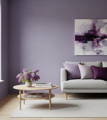
Purple
Purple combines the stability of blue with the energy of red, creating a unique balance between warm and cool. Historically associated with royalty and luxury, deeper purples can add drama and sophistication to formal areas, while lavenders and lilacs create gentle, soothing environments perfect for bedrooms or reading nooks. The blue undertones in most purples place them firmly in the cool color category.
Understanding Color Temperature: It’s All Relative
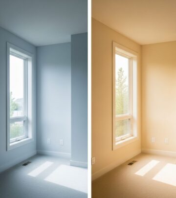
While we generally categorize colors as either warm or cool, it’s important to understand that color temperature exists on a spectrum. Even within a specific color family, there can be warmer and cooler variations. For instance, a blue with red undertones (like periwinkle) will appear warmer than a blue with green undertones (like teal).
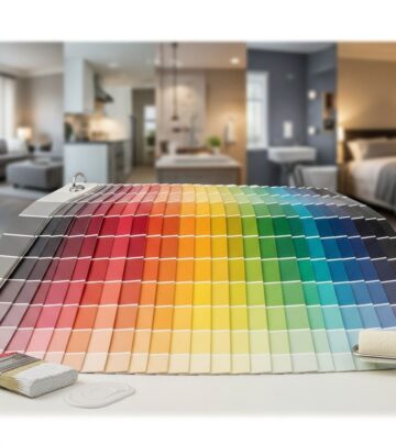
According to color theory, the key to identifying whether a specific shade leans warm or cool lies in understanding its undertones:
- Warm colors typically contain more red and orange undertones
- Cool colors typically contain more blue and green undertones
This understanding becomes particularly important when selecting neutral colors like whites, grays, and beiges for your home. A warm gray (often called greige) will have brown or yellow undertones, while a cool gray will have blue or green undertones. Choosing the wrong temperature of neutral can clash with your other design elements and create an uncomfortable visual experience.
How to Use Warm and Cool Colors in Your Home
Successfully incorporating color temperature into your home design requires thoughtful consideration of each room’s purpose, size, and lighting conditions. Here are some practical guidelines for using warm and cool colors effectively:
Consider Room Function
Think about what activities take place in each room and what atmosphere would best support those functions:
- Living rooms and family rooms: These gathering spaces often benefit from warm colors that promote conversation and comfort. Consider warm neutrals with pops of red, orange, or yellow.
- Bedrooms: Cool colors like soft blues, lavenders, and greens can create restful environments conducive to sleep and relaxation.
- Home offices: Blues and greens can promote focus and productivity, while small doses of warm colors can add energy when needed.
- Dining rooms: Warm reds and oranges stimulate appetite and conversation, making them excellent choices for dining areas.
- Kitchens: Both warm and cool colors can work well depending on the mood you want to create. Warm colors create cozy, inviting kitchens, while cool colors can make the space feel clean and refreshing.
Account for Room Size and Shape
Use color temperature to visually modify room dimensions:
- Make large rooms feel cozier with warm colors that advance and create intimacy
- Make small rooms feel more spacious with cool colors that recede and open up the space
- For long, narrow rooms, consider using warmer colors on the short end walls to visually push them inward and create better proportion
Consider Natural Light Exposure
The amount and quality of natural light in a room should influence your color temperature choices:
- North-facing rooms receive cooler, indirect light and can feel chilly with cool color schemes. Warm colors can counterbalance this effect.
- South-facing rooms receive abundant warm sunlight and can support both warm and cool colors effectively.
- East-facing rooms get bright, warm morning light but cooler afternoon light. Consider how the room is primarily used when choosing colors.
- West-facing rooms receive intense afternoon sun that intensifies warm colors, potentially making them overwhelming. Cooler tones can help balance this effect.
Creating Balance with Warm and Cool Colors
While understanding the distinction between warm and cool colors is important, most successful interior designs incorporate elements of both. Creating balance between warm and cool elements produces visually interesting and comfortable spaces. Here are some approaches to combining warm and cool colors:
The 80/20 Rule
A common design principle suggests using one temperature family for about 80% of a room’s color scheme, with the remaining 20% coming from the opposite temperature. For example, a predominantly cool blue bedroom might incorporate warm golden accents through pillows, artwork, or lighting fixtures.
Using Neutrals as Bridges
Neutral colors like gray, beige, white, and black can serve as bridges between warm and cool elements in a space. For instance, a greige wall color (warm gray with beige undertones) can harmoniously connect cool blue furniture with warm wood tones.
Creating Focal Points
Use the advancing quality of warm colors to highlight architectural features or important design elements. A cool-toned room with a warm-colored accent wall will naturally draw attention to that wall, making it an ideal place for artwork or an important furniture piece.
Frequently Asked Questions About Warm and Cool Colors
Can I mix warm and cool colors in the same room?
Absolutely! In fact, most successful interior designs incorporate both warm and cool elements. The key is to establish a dominant temperature (usually about 80% of the color scheme) and use the opposite temperature as an accent (about 20%). This creates visual interest while maintaining harmony.
How do I know if a specific shade is warm or cool?
Look for the undertones. Warm colors contain more red, orange, or yellow undertones, while cool colors have more blue or green undertones. You can compare colors side by side to make the undertones more apparent. For example, place two white paint samples together, and you might notice one has a yellowish undertone (warm) while the other has a bluish undertone (cool).
Do warm colors always make a room feel smaller?
While warm colors generally advance and can make spaces feel more intimate, the effect depends on many factors including the specific shade, lighting conditions, and other design elements. A light terra-cotta might create warmth without significantly reducing perceived space, while a deep burgundy would have a more dramatic space-reducing effect.
Are there colors that are neither warm nor cool?
Some colors sit near the transition points on the color wheel and can appear relatively neutral in temperature. Certain greens (like olive) and purples can sometimes bridge the warm-cool divide. Additionally, true neutral grays with no discernible undertones can work with both warm and cool color schemes.
How should I choose between warm and cool white paint?
Consider the existing elements in your room that can’t be changed easily, such as flooring, cabinetry, or stone surfaces. If these have warm undertones, choose a warm white. If they have cool undertones, select a cool white. Also consider light exposure—north-facing rooms often benefit from warm whites, while south-facing rooms can handle cool whites without feeling chilly.
Understanding the distinction between warm and cool colors provides a fundamental tool for successful interior design. By thoughtfully applying these principles to your home, you can create spaces that not only look beautiful but also feel right and function well for their intended purposes. Remember that there are no absolute rules in design—your personal preferences and the unique characteristics of your home should always guide your color choices.
References
Similar Articles
Read full bio of medha deb