5 Paint Color Trends You’ll See Everywhere in 2025
Discover the top paint color trends set to define 2025’s interiors—from muddy plums to earthy mauves—and learn how to use them in your home.
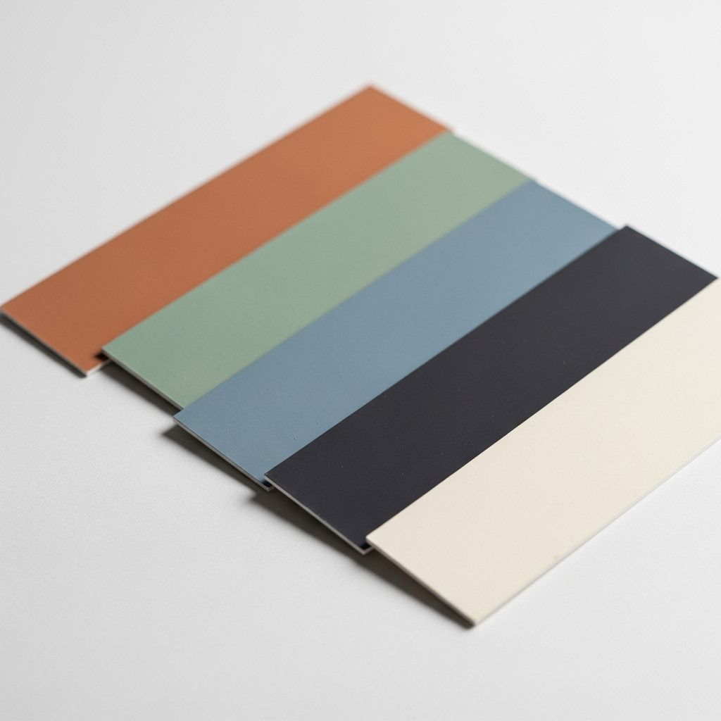
If you’re seeking fresh inspiration for your next home project, 2025 promises a bolder, deeper, and more emotionally resonant spectrum of paint colors. This year’s key shades are about warmth, grounding energy, and vintage revival, echoing both classic country sensibilities and emerging designer preferences. Say goodbye to sterile white and cold gray—earthy, complex tones are now leading the way. Read on to discover the top paint colors and the creative ways to use them in your home.
Muddy Plum: The New Rustic Neutral
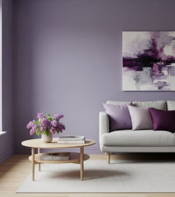
Muddy plum shades—deep, earthy purples blended with gray and brown—are dominating designers’ color picks for 2025. They are hailed for their sophisticated, countryside vibe and their ability to blend seamlessly with both traditional and contemporary décor schemes. These hues subtly nod to classic English interiors, bringing the romance of the outdoors in.
- Why it’s trending: Deep, muddy shades like aubergine and plum evoke warmth and nostalgia while remaining versatile enough for modern settings.
- Industry picks: Benjamin Moore crowned “Cinnamon Slate” as Color of the Year, while Glidden introduced “Purple Basil”, both perfect muddy plum examples.
- Beyond paint: Even wood stains are embracing this hue, with companies like Minwax naming “Violet” their stain of the year.
Expert Insight
Ariel Okin, a New York-based designer, notes: “Muddy tones, such as olive greens, deep chocolates, and plummy aubergines, reflect the countryside and bring the outdoors back in.” These nuanced purples provide depth without overwhelming, offering a cozy yet current palette for any space.
Favorite Plum Paint Colors
- Benjamin Moore Cinnamon Slate
- Glidden Purple Basil
- Farrow & Ball Brinjal
- Pittsburgh Paints Venetian Mask
- Minwax Violet Wood Stain
How to Use Muddy Plum
- Bedrooms: Create a cocooning effect by painting all four walls or just an accent wall for a modern-rustic touch.
- Living Areas: Feature plummy tones on built-ins or fireplaces for a moody, luxurious effect.
- Kitchens: Pair with deep green, cream, or walnut for cabinetry and island accents.
Cherry Red: A Playful Return to Americana
Cherry red emerges in 2025 as an energetic counterpoint to the muted tones of past seasons. This richer, moodier take on red is dubbed as both sweet and daring—channeling everything from classic Americana to playful TikTok trends.
- Pinterest Predicts: Searches for “cherry bedroom” doubled in the last year, reinforcing the red revival.
- Primitive Influence: The primitive country aesthetic—a resurgence led by tastemakers like Audrey Gelman of The Six Bells—embraces pure, primary colors like cherry red, conjuring nostalgia for classic rural homes.
- Industry picks: Behr selected “Rumors” as its 2025 Color of the Year—a muddier, lived-in red reminiscent of weathered barns and antique tin.
Favorite Cherry Red Paint Colors
- Behr Rumors
- Farrow & Ball Eating Room Red
- Benjamin Moore Heritage Red
- Valspar Cherry Radiance
- Clark+Kensington Candy Apple
How to Use Cherry Red
- Accent Details: Try a burst of cherry red on interior doors, trim, or ceiling medallions for a refined, unexpected accent.
- Kitchens: Cherry red islands or cabinetry evoke classic farmhouse warmth.
- Dining Rooms: Paint dining chairs or built-ins for a celebratory, inviting space.
Earthy Mauve: The New Sophisticated Neutral
Earthy mauve is the season’s most nuanced neutral—subtle, complex, and highly adaptable. Pantone’s 2025 Color of the Year, “Mocha Mousse”, epitomizes this shift from stark, cool neutrals to warmer, more comforting shades. This pinkish-brown conveys understated elegance and a sense of lived-in luxury.
- A historical progression: Pantone started this trajectory with “Peach Fuzz” in 2024, and now “Mocha Mousse” brings added depth and drama. Industry favorites in previous years, such as “Persimmon” (HGTV Home by Sherwin-Williams) and “Redend Point” (Sherwin-Williams), have paved the way.
- Why it’s popular: Earthy mauve feels more personal and less sterile than gray, perfectly bridging the desire for color and comfort.
Favorite Mauve Paint Colors
- Pantone Mocha Mousse
- Sherwin-Williams Redend Point
- Benjamin Moore Mauve Mist
- Graham & Brown Alizarin
- HGTV Home by Sherwin-Williams Persimmon
How to Use Earthy Mauve
- Bathrooms: Use for cabinetry or walls to introduce warmth while maintaining a tranquil feel.
- Living Rooms: Mauve pairs beautifully with taupe, deep green, and gold accents for an inviting palette.
- Bedrooms: Consider as an alternative to beige or blush for a cozier, more grounded effect.
Warm Greens: Nature’s Enduring Embrace
Greens of all shades continue to captivate for 2025, but this year’s trend veers toward warm, brown-based tones that reference the richness of forest moss and olive groves. Gone are the flat, grayish sages—a more organic, grounded green now reigns.
- Versatility: Suitable for walls, cabinetry, trim, and even exteriors, warm greens work just as well in contemporary lofts as they do in historic homes.
- Designer picks: Benjamin Moore’s “Pinelands”, Sherwin-Williams “Oakmoss”, and Farrow & Ball “De Nimes” exemplify this rooted trend. These shades bring timeless character and a sense of calm to every surface.
Favorite Green Paint Colors
- Benjamin Moore Pinelands
- Sherwin-Williams Oakmoss
- Farrow & Ball De Nimes
- Sherwin-Williams Clary Sage
- Behr Hidden Forest
How to Use Warm Greens
- Kitchens: Cabinetry and islands in deep green pair well with brass hardware and butcher block counters.
- Bedrooms: Accent an architectural detail like a fireplace or built-ins.
- Living Spaces: Use as an accent wall or pair with wood tones for a cozy, natural retreat.
Moody Browns: Cozy Where It Counts
Deep browns reflect a growing demand for moodier, more intimate interiors. These shades provide comfort while remaining luxurious, offering a rich backdrop for both vibrant colors and neutral palettes. From soft chocolate to muddy taupe, browns are a discerning choice for those seeking timeless elegance with a modern edge.
- Designer Insights: Spaces painted in tones like “Dirty Chai” or Benjamin Moore “French Canvas” create drama and sophistication.
- Pairings: Browns shine alongside muted mauves, warm reds, and complex greens.
Favorite Brown Paint Colors
- Clare Dirty Chai
- Benjamin Moore French Canvas
- Sherwin-Williams Warm Stone
- Behr Sandstone Cove
- Farrow & Ball London Clay
How to Use Moody Browns
- Kitchens & Dining: Use on lower cabinetry or even for a dramatic ceiling.
- Entryways: A brown accent wall creates an inviting, sheltered atmosphere.
- Bedrooms: Layer with creamy whites and mauves for depth and coziness.
Paint Color Comparison Table
| Color Name | Base Tone | Trending Use | Sample Brand/Reference |
|---|---|---|---|
| Muddy Plum | Purple with brown/gray undertones | Living rooms, bedrooms, built-ins | Benjamin Moore Cinnamon Slate, Glidden Purple Basil |
| Cherry Red | Rich red with dark undertones | Entryway accents, kitchens, playful details | Behr Rumors |
| Earthy Mauve | Pinkish brown, earthy | Bathrooms, living rooms, bedrooms | Pantone Mocha Mousse |
| Warm Green | Browny-green, olive, mossy | Kitchens, bedrooms, cabinets | Sherwin-Williams Oakmoss, Benjamin Moore Pinelands |
| Moody Brown | Deep brown, taupe, cocoa | Dining rooms, entryways, bedrooms | Clare Dirty Chai, Benjamin Moore French Canvas |
Frequently Asked Questions (FAQs)
Q: How can I incorporate bold 2025 colors without overwhelming my space?
A: Use these trend colors in smaller doses—think accent walls, cabinets, interior doors, or paired with calming neutrals like cream or taupe. Accessories like pillows or art can also introduce color, allowing flexibility as trends shift.
Q: Are these 2025 paint colors suitable for every style of home?
A: Absolutely. From rustic farmhouses to modern apartments, these colors can be tailored with the right pairings. For instance, muddy plum or moody brown delivers coziness to traditional spaces, while sharp cherry red can inject energy in minimalist rooms.
Q: Do these colors work together?
A: Yes—many 2025 colors stem from a nature-inspired palette, making them easy to layer. Pair earthy mauves with muddy plum, or cherry red with moody brown, for a harmonious transition between rooms.
Q: Will these colors age well, or are they just for 2025?
A: Many featured shades—particularly earthy, muddied neutrals and rich greens—offer true longevity thanks to their grounding qualities. Incorporate trendier hues like cherry red in easy-to-swap places if you like to update often.
Q: What finish should I use for these trending colors?
A: For most wall applications, matte or eggshell finishes highlight the depth of 2025’s paint trends. For kitchens, baths, and trim, select satin or semi-gloss for durability and subtle sheen.
References
- https://www.countryliving.com/home-design/color/a62940054/color-paint-trends-2025/
- https://www.countryliving.com/home-design/color/a65369719/green-paint-trend-2025/
- https://www.youtube.com/watch?v=ERkepj0Uyqo
- https://www.youtube.com/watch?v=sC3Kcd2Bz84
- https://luxesource.com/article/2025-paint-color-trends
Read full bio of medha deb

