The Most Popular Paint Colors of All Time: Essential Classics for Every Room
Discover iconic paint colors that define style, from historic reds to modern neutrals and timeless blues.

The Most Popular Paint Colors of All Time
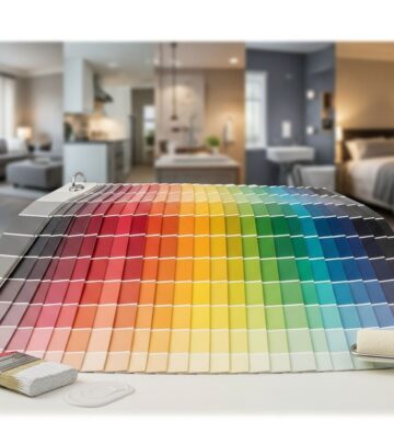
Choosing a paint color for your home can be overwhelming, but some shades have stood the test of time, captivating homeowners, designers, and even historians. From rustic reds rooted in tradition to modern jewel tones, and from sunshine yellows to versatile neutrals, this guide details the most iconic colors for every room. Whether you’re seeking to evoke nostalgia or set a fresh design direction, there is a time-honored hue awaiting you.
Why Certain Colors Endure
- Historic relevance: Many classic paint colors are inspired by architectural history and traditional pigments.
- Designer favorites: Top designers repeatedly turn to reliable hues for broad appeal and lasting style.
- Versatility: Popular colors often pair easily with various furnishings and finishes across eras.
- Emotional resonance: Certain shades evoke comfort, calm, or vibrancy, making spaces feel inviting.
Timeless Reds: Warmth, Drama, and Tradition
Red is a color deeply rooted in history and emotion. From regal to rustic, here are captivating reds that have colored homes for generations:
- King’s Red by Benjamin Moore: Inspired by Colonial Williamsburg’s historic palette, this regal vermillion exudes sophistication, echoing the deep pigments favored in earlier centuries.
- Barn Red by Valspar: Once the protective mixture for barn wood, this iconic hue is both practical and visually striking, recalling pastoral landscapes and American farmhouses.
- Crabby Apple by Sherwin-Williams: This deep, rusty red has literary provenance, famously gracing the floors of poet Robert Frost’s family home and invoking timeless character.
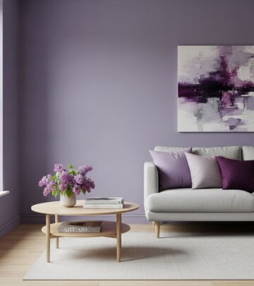
Jewel Tones and Relaxed Purples
- Grape Juice by Benjamin Moore: With gray undertones, this rich purple is refined and understated, perfect for adding depth without overwhelming a room.
- Brassica by Farrow & Ball: Bridging classic lavender with masculinity, Brassica is nuanced by a touch of gray for beautiful complexity.
- Gin Blossoms by Backdrop: A favorite for bold powder rooms, this lively hue invites adventurous decorating in compact spaces.
Refreshing Yellows: Joyful and Inviting
Yellow shades can make interiors cheerful and cozy, from soft pastel to golden warmth:
- Icy Lemonade by Sherwin-Williams: A cool, calming yellow ideal for nurseries and gender-neutral spaces, pairs beautifully with blues.
- Vintage Yellow by Glidden: Evokes buttery McCoy pottery and works perfectly in country-inspired kitchens.
- Lightning Bug by Benjamin Moore: A vibrant burst of color, memorable for its electric brightness in bedrooms or on accent doors.
- Classical Yellow by Sherwin-Williams: Sunny yet dignified, suitable for Colonial and Georgian homes, embodying historic charm.
- Grass Daisy by Glidden: A retro chartreuse with literary nostalgia, playful for flooring in minimalist white rooms.
- Sudbury Yellow by Farrow & Ball: Golden and grounded, reminiscent of a setting sun, beloved for cheerful yet sophisticated kitchens.
- Damask Gold by Benjamin Moore: Mustard shades rooted in Colonial paints, lively yet sophisticated with ochre undertones.
- India Yellow by Farrow & Ball: Muddy gold with strong compatibility with natural wood and stone, adds cozy complexity.
Greens: Nature-Inspired and Serene
Greens extend from lively spring hues to moody and grounding shades, perfect for interiors and exteriors alike:
- Oh Pistachio by Sherwin-Williams: Happy and bright, with a hint of yellow, ideal for eye-catching front doors.
- Agate Green by Sherwin-Williams: A sage green celebrated for blending seamlessly with outdoor landscapes, making it a top choice for home exteriors.
- Breakfast Room Green by Farrow & Ball: Clean, happy, and soothing at all hours, chosen for bedrooms and closets.
Iconic Blues: Tranquil, Moody, and Enduring
Blue remains a perennial favorite for its calming and classic appeal. These shades cover all moods, from gentle seaside to sophisticated navy:
- Azurite by Benjamin Moore: Striking and impactful, suitable for dramatic statement walls.
- Open Seas by Sherwin-Williams: A coastal-inspired blue with subtle teal undertones, perfect for creating relaxing or beachy atmospheres.
- Inchyra Blue by Farrow & Ball: Ambiguous and rustic, dusty blues like this deliver a weathered timelessness.
- Kensington Blue by Benjamin Moore: The archetypal navy, embraced by designers and part of the trusted Classics Collection.
- Denim by Sherwin-Williams: Soft and familiar, reminiscent of beloved jeans—creates spaces that feel instantly comforting.
- Vintage Velvet by Behr: Navy with a hint of purple for mysterious, bold backdrops.
- Salty Dog by Sherwin-Williams: Sea-inspired navy for studies or leather-filled rooms, delivers unmistakable sophistication.
- Newburyport Blue by Benjamin Moore: Moody and historic, inspired by Massachusetts’ coastal city.
Timeless Neutrals: Foundation for Every Style
No list of popular paint colors is complete without enduring neutrals that work for walls, trim, and every surface in between:
- Tricorn Black by Sherwin-Williams: A designer favorite for doors, trim, and ceilings, celebrated for its striking contrast alongside crisp whites.
- White Dove by Benjamin Moore: Universally lauded for its versatile balance—creamy but crisp, suitable anywhere.
- Dark Chocolate by Benjamin Moore: Rich, true brown for grounding spaces, full-bodied and sumptuous.
- Silver Lining by Benjamin Moore: Blue-tinged gray, offering a modern alternative to neutral grays that can feel fresh while remaining timeless.
Decorating Advice: Pairing Popular Colors with Your Space
- Mix high-impact shades with neutrals: Use bold colors for feature walls, doors, or trim while balancing with classic whites or sophisticated grays.
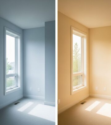
- Consider natural light: Rooms bathed in sunlight handle deeper hues well, while darker spaces benefit from lighter, reflective shades.
- Historic for character, modern for freshness: Combine historically rooted colors with contemporary furniture to keep interiors relevant.
- Think beyond walls: Don’t overlook the impact of painting ceilings, floors, accent furniture, or cabinetry in classic hues.
Paint Color Comparison Table
| Color Name | Brand | Type | Ideal Use |
|---|---|---|---|
| King’s Red | Benjamin Moore | Historic Red | Accent walls, Libraries |
| Icy Lemonade | Sherwin-Williams | Cool Yellow | Nurseries, Bathrooms |
| Kensington Blue | Benjamin Moore | Navy Blue | Bedrooms, Living Rooms |
| White Dove | Benjamin Moore | Neutral White | Walls, Ceilings, Trim |
| Tricorn Black | Sherwin-Williams | True Black | Doors, Shutters, Trim |
| Breakfast Room Green | Farrow & Ball | Bright Green | Bedrooms, Closets |
Designer Insights: Why These Colors Work
- Maribeth Jones: Advocates jewel tones and design-forward choices in compact spaces, emphasizing mood and creativity.
- Anna Logan: Favors bright personal spaces and memorable colors, noting how color can shape experiences and nostalgia.
- Heidi Caillier: Prefers earthy yellows and golds for unusual but cozy environments, always considering texture and natural lighting.
- Amy Mitchell: Selects greens for their uplifting qualities that shift with daylight, using in both private and communal rooms.
- Sarah Zlotnick: Emphasizes green exteriors that harmonize with natural landscapes for lasting curb appeal.
Frequently Asked Questions (FAQs)
Which paint color should I choose for a historic home?
Colors with historic roots—such as King’s Red, Damask Gold, or Classical Yellow—are inspired by time-tested pigments and architectural tradition, making them perfect for period homes and restoration projects.
What is a foolproof neutral?
White Dove by Benjamin Moore is widely recommended by designers for its versatility and subtle warmth, making it suitable for walls, trim, or ceilings in almost any style of home.
How do I pick a bold color without regret?
Opt for a deep hue that’s beloved in design circles, like Kensington Blue or Crabby Apple. These colors have enduring appeal because they work with a wide range of furnishings and are favored in designer portfolios.
Is it better to use dark or light colors in small spaces?
Both approaches can work: light colors open up small spaces and reflect more light, while dark, rich hues add drama and can make a space feel like a cozy cocoon, especially when balanced with bright accents or ample lighting.
Are mustard yellow or deep greens too trendy?
Mustard yellows and deep greens are rooted in historic paint traditions and have been updated for modern tastes, making them simultaneously classic and current—safe choices with character.
More Inspiration for Every Room
- Kitchens: Buttery yellows and soft whites feel inviting and warm.
- Bedrooms: Gentle greens, calming blues, and muted purples foster rest and relaxation.
- Bathrooms: Vibrant jewel tones or cool yellows make compact spaces pop.
- Living Rooms: Navy blues, grounded browns, or elegant grays create timeless backdrops.
- Exteriors: Sage greens, bold blacks, and classic whites ensure curb appeal and elegance.
Expert Tips for Lasting Results
- Sample before you commit: Always test shades in your intended room alongside your lighting and décor.
- Consider undertones: Look for subtle hints of gray, yellow, green, or blue that can affect how a color reads in your space.
- Think beyond trends: Select colors that fit your home’s architecture and your long-term preferences, not just what’s popular now.
- Pair with finishes: Matte, satin, and gloss can dramatically change how a color looks—choose wisely for the effect you want.
Inspired by History, Made for Today
Whether you gravitate toward the primitive reds of Colonial America, the joyful embrace of golden yellows, the serenity of nature-inspired greens, or the classic confidence of navy blues and crisp whites, these most popular paint colors carry stories from the past and design innovation into the future. By tuning into what makes these hues timeless, you can create a home that feels both fresh and rooted—comforting and inspired, no matter the era or aesthetic you love.
References
- https://www.countryliving.com/home-design/color/a61601390/most-popular-paint-colors-of-all-time/
- https://www.countryliving.com/home-design/color/g64543047/no-regret-paint-colors/
- https://www.hgtvhomebysherwinwilliams.com/en/colors/color-collections/rustic-farmhouse
- https://www.sherwin-williams.com/en-us/color/color-collections/top-50-colors
Similar Articles
Read full bio of medha deb