Why Lilac Is the Least Popular Paint Color—and Why It Deserves a Second Look
Explore why Radiant Lilac is Sherwin-Williams' most overlooked shade—and how this subtle purple can work beautifully in modern homes.

Why the “Most Hated” Paint Color in America Deserves a Second Chance
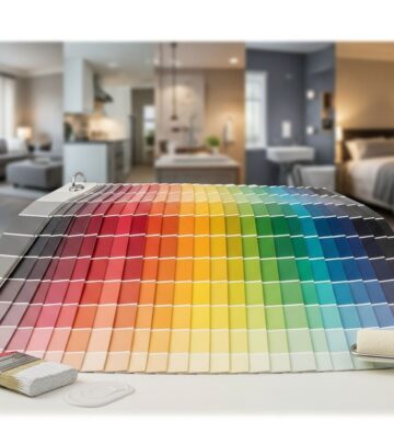
Every year, paint companies reveal their most beloved shades—those crowd-pleasing neutrals and bold hues that find their way onto bedroom walls, kitchen cabinets, and front doors across the country. But what about the shades that sit untouched on the shelf? In 2025, Sherwin-Williams brought attention not to its biggest seller, but to its least popular paint color: Radiant Lilac SW 0074, the so-called “Loneliest Color.” Beneath its underdog status lies a nuanced, serene tone that may just deserve a second look from home decorators, designers, and color-curious homeowners alike.
Table of Contents
- Spotlight on Sherwin-Williams’ Loneliest Color
- What Is Radiant Lilac?
- Why Is Radiant Lilac So Unpopular?
- Expert Perspectives: The Challenge of Decorating with Lilac
- The Case for Second Chances
- How to Use Lilac in Home Decor
- What the Latest Color Trends Tell Us
- Frequently Asked Questions
Spotlight on Sherwin-Williams’ Loneliest Color
For the second year in a row, Sherwin-Williams highlighted its least popular paint color—a strategy aimed at sparking conversations in a world obsessed with color trends and popularity contests. In 2024, the company saw millions of gallons of paint tinted in homes across America, but fewer than 1,000 gallons of Radiant Lilac made their way out of the store and onto consumer walls. By putting the color at center stage, Sherwin-Williams hopes to celebrate the beauty of what is typically overlooked and inspire people to think differently about color choices.
What Is Radiant Lilac?
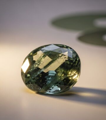
Radiant Lilac SW 0074 is a light, gentle purple, situated between pastel lavender and grayish-mauve. According to Sherwin-Williams, Radiant Lilac is a “true lilac”—a soft, feminine hue that’s brighter than the antique violets and muddier plums that have crept into recent color forecasts. It stands out as a shade that’s neither a classic neutral nor a daring statement color, landing in what designers sometimes call the “in-between zone.”
- Color Profile: Pale purple with a subtle gray undertone.
- Position in Palette: Not as bold as deep plums, but not as muted as classic grays or beiges.
- Comparisons: Brighter than lavender, softer than violet, and more approachable than vivid magentas.
This hue differs from reigning colors like Benjamin Moore’s “Blue Nova” or Glidden’s “Limitless”—both high-profile shades of the year for 2025.
Why Is Radiant Lilac So Unpopular?
The public has spoken—at least with their wallets—and Radiant Lilac is among the least requested tints at Sherwin-Williams stores nationwide. But what’s at the core of its lack of popularity?
- Purple as a Commitment: Consumers often see purple as a big risk, fearing it may date a space or make it hard to coordinate furniture and decor.
- Neutrals Dominate: For years, soothing whites, beiges, grays, and greiges have been the go-to. The popularity of mainstays such as Swiss Coffee and Pink Ground show a strong preference for versatile, barely-there hues.
- Uncertainty Factor: As Sherwin-Williams’ Director of Color Marketing Sue Wadden notes, Radiant Lilac “sits in that in-between space: it’s not a neutral, but it’s not an overwhelming statement either, which can make it feel a little uncertain for some.”
While muddier plums and jewel tones like navy or emerald are seeing their moment in design trend reports, lilac’s softer vibe simply hasn’t found as much love.
Expert Perspectives: The Challenge of Decorating with Lilac
Designers and color experts agree—getting purple right is tricky. While a shade like lilac can feel fresh and charming in some rooms, it can also evoke memories of outdated nurseries or 1980s pastel overload if not paired thoughtfully. Here are common hurdles decorators cite:
- Historical Luggage: Lilac recalls childhood bedrooms or vintage bathrooms, making it harder to sell to homeowners wanting a modern or elegant vibe.
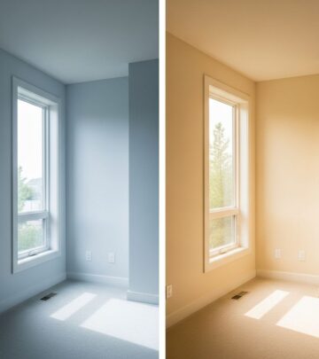
- Lighting Sensitivity: This shade can shift dramatically based on light exposure. Poor lighting may make it appear gray or cold, while bright light can wash it out.
- Coordination Challenges: Finding the right accent colors, textiles, and hardwood tones to balance lilac’s coolness requires thoughtful planning.
Yet, as with any color, the secret is using it with intention—paired with the right companion shades and design elements, lilac can move from dated to on-trend.
The Case for Second Chances
Why spotlight a color with such a poor track record? Sherwin-Williams believes the story of Radiant Lilac is about reconsidering what “unpopular” really means.
- Challenging the Status Quo: Celebrating the loneliest color disrupts the endless cycle of chasing what’s popular.
- Lilac’s Hidden Versatility: Light purple is often overlooked, yet it can invoke calm, creativity, and quiet sophistication in the right context.
- Personalization over Conformity: Choosing a color outside the mainstream can create a highly personal, unique space.
As Sue Wadden puts it: “Instead of chasing what’s popular, we’re shining a light on something overlooked and underappreciated. It’s a unique and refreshing take on color… we’re having the best time sharing that story!”
How to Use Lilac in Home Decor: Tips from the Pros
If you’re curious to bring lilac into your own space, follow these expert strategies for maximum impact and timeless appeal:
- Pair with Neutrals: To keep the look fresh, combine lilac walls with white or cream trim, soft taupe upholstery, or pale woods. This tones down the purple and gives a hint of color without overwhelming the eye.
- Contrast with Warm Accents: Brass, gold, or honey-colored woods add warmth that balances lilac’s cool tone, creating a more inviting atmosphere.
- Layer with Textures: Cozy throws, velvet cushions, and wool rugs in analogous tones (lavender, silvery gray, blush pink) elevate visual interest and comfort.
- Create a Statement: Use lilac on a single accent wall, door, or piece of vintage furniture for a playful pop without committing to an entire room.
- Embrace Florals and Patterns: Botanical prints, soft plaids, or watercolor-inspired artwork complement the floral roots of lilac’s color name.
| Design Concept | Why It Works with Lilac |
|---|---|
| Modern Farmhouse | Makes soft lilac feel airy when set against white shiplap or matte black accents. |
| Art Deco Glam | Pairs well with metallics (brass, gold) and plush textiles for a luxe look. |
| Cottagecore | Cozy, layered, and inherently nostalgic—lilac blends naturally with florals and handmade details. |
| Minimalist | Acts as a quiet alternative to stark white or gray, perfect for a single wall or a reading nook. |
What the Latest Color Trends Tell Us
Design trends in 2025 offer hope for colors like lilac:
- Plum and Purple Tonalities: Rich purples are seeing renewed interest, especially in high-end design. Benjamin Moore’s and Glidden’s color forecasts include plum as shades of the year—a sign lilac may soon have its moment.
- Breaking the Gray Mold: While gray remains popular, many designers warn against defaulting to it. Blue-grays such as “Silver Lining” (a designer favorite) offer alternatives, showing an appetite for nuanced soft color.
- Color as Self-Expression: As the trend toward maximalism and eclectic interiors grows, more homeowners feel encouraged to experiment with less conventional hues.
In this context, Radiant Lilac’s gentle optimism aligns well with the move toward personalized, expressive spaces.
Frequently Asked Questions
Q: Why is Radiant Lilac Sherwin-Williams’ least popular paint color?
A: Radiant Lilac is chosen less often due to common perceptions that purple is bold and tricky to use in home interiors. Its location between statement and neutral colors makes it harder for many to visualize in their space.
Q: How do I keep lilac from looking too childish or outdated?
A: The key is pairing lilac with modern or sophisticated finishes: try brass fixtures, contemporary silhouettes, or natural materials. Avoid pairing it exclusively with old-fashioned florals or pastel overload.
Q: Where can I successfully use Radiant Lilac in my home?
A: Bedrooms, powder rooms, creative studios, and even cozy reading spaces are all excellent candidates. Use with restraint to add a serene ambiance without overpowering a room.
Q: Is there a risk of lilac going out of style even if I use it now?
A: While paint trends change, there’s a growing movement toward embracing personal preferences. Tastefully used, lilac can feel timeless, especially when balanced with classic furnishings.
Q: What other colors pair well with lilac?
A: Lilac looks especially good alongside creams, whites, muted golds, deep greens, and silvery grays. For a daring look, try indigo blue or olive as a contrasting accent.
Final Thoughts: Should You Give Lilac a Try?
While Radiant Lilac remains Sherwin-Williams’ least popular paint color, its soft profile and unique character challenge decorators to look past what’s trending. This loneliest hue is an invitation to creativity—to see the potential in the neglected and infuse your living spaces with an unexpected twist. Whether you embrace lilac in an accent piece or dive into a full room refresh, you can feel confident in giving new life to an underrated classic.
References
- https://www.aol.com/sherwin-williams-just-revealed-least-145924452.html
- https://www.countryliving.com/home-design/color/a64744378/least-popular-paint-color/
- https://www.hellolovelystudio.com/2025/08/less-popular-paint-colors.html
- https://maisondecinq.com/my-favorite-paint-colors/
- https://www.countryliving.com/home-design/color/g64543047/no-regret-paint-colors/
Similar Articles

Read full bio of Sneha Tete