How Room Orientation Influences Paint Color Choice
Bring out the best in every room by choosing paint colors tailored to your space's orientation and unique light.

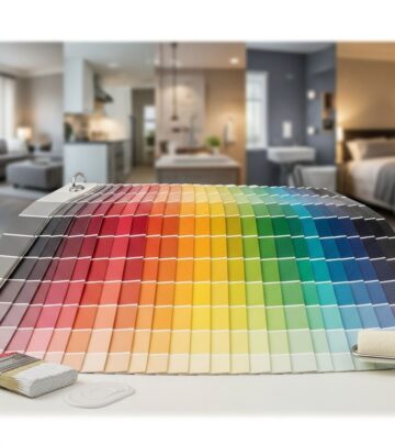
Anyone who has ever painted a room knows that the color on your wall may look dramatically different by afternoon than it did at sunrise. This phenomenon is not just about color swatches or finish—it’s about how room orientation and light exposure transform the way colors appear. Understanding the play of natural light through north, south, east, or west windows empowers you to make design choices that enhance your home’s beauty and comfort. This comprehensive guide explains how light direction impacts paint color, why it matters, and how you can leverage this knowledge for stunning results in every space.
Why Room Orientation Matters In Paint Color Selection
Light is the single most influential factor in how a paint color appears on your walls. The orientation of windows—north, south, east, or west—determines the quality (warm or cool), intensity, and duration of sunlight entering a room. Paint color can look cooler, warmer, brighter, or more muted based on these variables, which can lead to surprise (and sometimes disappointment) if you’re unprepared. That’s why designers stress testing swatches on multiple walls, at different times of day, under both natural and artificial light sources before committing to a color.
- North-facing rooms receive indirect, cool light—often making colors appear grayer or bluer.
- South-facing rooms get abundant warm sunlight, intensifying colors and sometimes causing yellows, reds, and oranges to feel even richer.
- East-facing rooms bask in morning light that is bright and crisp, but lose warmth as the sun moves away.
- West-facing rooms are muted early but become dramatically warmer and more golden by afternoon and evening.
North-Facing Rooms: Cool, Subtle, and Often Softly Lit
North-facing windows let in steady, indirect daylight that trends cool and slightly blue throughout the day. This means paints can look more subdued, grayed out, and less vibrant than expected. Colors with cool undertones may appear cold, while those with warmth in their formula can look balanced and inviting.
- Opt for colors with warm undertones to counteract the chill of the light. Soft creams, buttery yellows, gentle peach, or warm shades of white bring light and comfort into spaces otherwise prone to feeling flat.
- Darker hues, like deep charcoals, navy, or mossy green, can create a cozy, cocooning effect if you embrace the cool natural light rather than trying to fight it.
- Avoid cool grays, icy blues, or stark whites—they often feel sterile or uninspired in these conditions.
Mirrors and reflective surfaces help bounce light, maximizing brightness in north-facing spaces. It’s advisable to always sample paint colors on every wall in these rooms, observing how both daylight and artificial light at night affect the mood.
Sample Color Ideas for North-facing Spaces
- Soft yellow-based whites
- Creams and light beiges
- Warm taupes or muted pinks
- Deep, enveloping shades for a dramatic look (if desired)
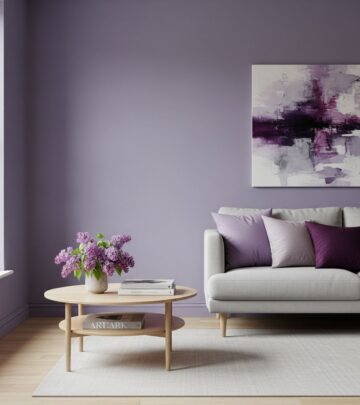
South-Facing Rooms: Abundant Light and Flexibility
South-facing rooms are drenched in sunlight, especially at midday, providing the truest and warmest color rendition. This orientation offers the greatest flexibility in paint choice, since both cool and warm shades feel lively and inviting here. However, bright sunlight may intensify colors—causing bold shades to look even more saturated than anticipated.
- Cool hues like blues, greens, and crisp whites feel fresh, airy, and well-balanced in the generosity of southern light.
- Warm shades can become vibrant and sometimes overwhelming, particularly with yellows, reds, or rich oranges. In cases with abundant sunlight, you may prefer more muted versions of these colors for a sophisticated effect.
- Pale colors look especially light and spacious, making them ideal for creating an open, breezy atmosphere.
Because southern light is naturally uplifting, you have freedom to experiment. Just keep in mind that some deeper colors might fade with prolonged sun exposure, so high-quality, UV-resistant paints are preferable for rooms with large, south-facing windows.
Color Suggestions for South-facing Rooms
- Soft blues and seafoam greens
- Muted grays without overtly blue undertones
- Creamy, yellow-based whites
- Delicate pastels or pale coral for a touch of warmth
East-Facing Rooms: Morning Radiance and Evening Muted Light
East-facing rooms are at their liveliest in the early hours, filled with clean, soft golden sunlight. By afternoon, these spaces often feel less vibrant, as the daylight shifts and recedes, turning almost flat or cool-gray. The way a paint color reads in the morning may be dramatically different later in the day, requiring a more nuanced approach to shade selection.
- For rooms used in the morning, capitalize on the brilliance of morning sun with fresh, lively shades—green, turquoise, light yellow, or other energetic hues.
- For afternoon or evening use, cooler blues, gentle greens, or even deeper, darker tones can create a serene, calming feel that works with the dimmer light.
- Neutral shades with subtle warmth (such as warm grays or pale peach) maintain balance throughout the day.
If you want to avoid your east-facing space feeling dull in the evening, stay away from cool grays or stark blues as the light diminishes. Instead, blend warm and cool accents in your decor for a dynamic yet harmonious effect.
Top Paint Choices for East-facing Rooms
- Bright greens or light yellows for morning cheerfulness
- Soft blues, mint, or sage for later in the day
- Warm neutrals and creamy whites for all-day balance
West-Facing Rooms: Subdued Mornings, Glowing Afternoons
West-facing rooms wake up in cool, flat light that can dull even the most vibrant shades. By late afternoon, however, these rooms often fill with warm golden or orange light that can dramatize colors—sometimes in surprising ways.
- Expect cool undertones in the morning and pronounced warmth in the late afternoon and evening. Paint colors can appear to shift, becoming richer and redder as the sun moves.
- If you use the space most in the evening, choose colors that glow under warm light—soft pinks, creamy whites, corals, and warm neutrals.
- For morning functionality, consider more muted, light-reflective shades that won’t feel cold, such as sandy beige or pale yellow.
- Adapt with chameleon shades—colors that subtly change character in different light, like silvery blues or green-tinged grays.
Balancing the dramatic changes in west-facing room light can be achieved by blending warm and cool tones in paint and decor. Paint samples should always be observed at several times of day before making your final choice.
Ideal Colors for West-facing Spaces
- Soft blush pinks or corals
- Sandy beige or taupe
- Light, adaptable blues or greenish-grays
- Warm whites for consistency
Rooms With Mixed Exposure: Navigating Dual or Triple Window Positions
Many rooms aren’t neatly aligned with a single compass point, especially in open-plan homes or spaces with two or more window orientations. The core principle in these situations is to:
- Identify the dominant exposure (largest window area or most unimpeded light) and let that guide your color decisions.
- If exposures are roughly equal, sample colors in multiple locations and multiple times of day, and consider harmonious mid-tone neutrals or versatile taupes and greiges. These shades adapt well to shifting light conditions and nod to both warm and cool undertones when necessary.
- If you have conflicting warm and cool exposures (like north and south), reflect your personal preference: go warmer if you dislike coolness or cooler if you dislike warmth, or find a middle ground that pleases your eye.
Choosing Paint for Complex Exposure
Rooms with three exposures—or daylight coming from more than one direction—will show dramatic shifts in color. Lean on color choices that feel pleasing to you and unify the room, rather than trying to optimize for every single section. Often, the quality of light will vary across the day, so embrace a degree of variability in your design.
The Role of Artificial Light
Don’t forget: Artificial lighting alters wall colors after sundown or in windowless spaces. Common household bulbs fall into three main categories, each influencing color appearance differently:
- Incandescent and Halogen bulbs: Emit yellowish light, making wall colors look warmer and amplifying reds, yellows, and oranges.
- Cool white or daylight LEDs: Cast a blue tint, subtly cooling the appearance of walls—especially noticeable on whites and blues.
- Neutral white LEDs: Most accurately replicate daylight and offer the truest representation of a color’s original hue.
Always view paint swatches at night under your room’s lighting to avoid surprises. Layering different light sources—overhead, sconce, table lamp—can give you better control over ambiance and mitigate the impact of any one bulb type.
Tips for Testing Paint Samples and Final Selection
- Paint large swatches on every wall you intend to treat, observing over several days in different lighting conditions.
- Consider finish: Flat/matte paint mutes color, while satin, eggshell, or gloss finishes reflect more light and can shift a shade’s appearance.
- Factor in floor color, ceiling, and existing furnishings—they all affect the way light bounces and interacts with wall color.
- When in doubt, opt for sample pots before committing to gallons, and never select a final color based solely on a digital screen or chip.
Summary Table: Room Orientation and Paint Color Impact
| Room Orientation | Natural Light Effect | Recommended Color Types | Avoid |
|---|---|---|---|
| North-facing | Cool, consistent, blue-tinted | Warm whites, soft yellow, creams, taupe | Cool grays, icy blue, stark white |
| South-facing | Warm, bright, strongest at midday | Cool blues, greens, pastels, muted reds | Very intense warm shades (can be too bold) |
| East-facing | Bright in AM, dim and cool in PM | Lively green, yellow, blue; warm neutrals | Cool gray/blue (especially for PM use) |
| West-facing | Dim/cool in AM, golden/warm in PM | Pink, coral, warm beige, light blue | Strong, pure cool tones for evening rooms |
Frequently Asked Questions
Q: Can I use white paint in a north-facing room?
A: Yes, but avoid crisp, blue-based whites. Opt for warm whites with creamy, yellow, or peach undertones to prevent the space from feeling cold and uninviting.
Q: What’s the best way to pick a color in rooms with more than one exposure?
A: Prioritize the dominant exposure (largest or brightest window) or sample potential shades at every main source of natural light. Taupes and greiges often bridge the gap between cool and warm spaces.
Q: Do artificial lighting types really make a difference?
A: Absolutely. Bulbs with a yellow cast (incandescent/halogen) warm up paint colors, while cooler LEDs can make them look more blue or clinical. Always test your chosen color at night with the lights you’ll be using most.
Q: Which direction gives the most flexibility for paint color?
A: South-facing rooms are the most versatile, as the abundant, balanced light shows paint colors in their truest and most flattering form, both warm and cool.
Q: How do I minimize surprises when painting?
A: Always test large color swatches on every wall, check at different times of day, and view under both natural and artificial light sources. This helps you see how the undertone and vibrancy of each shade shift throughout the day and evening.
Final Thoughts
Room orientation isn’t just a technical detail—it’s a key ingredient in feeling satisfied with your color choices. By understanding and working with sunlight, you can design rooms that feel welcoming, harmonious, and ideally suited to their use and your personal taste. Use these guiding principles and never be afraid to experiment or consult a design professional as needed.
References
- https://www.kylieminteriors.ca/how-to-choose-paint-colours-for-a-room-with-2-exposures/
- https://www.farrow-ball.com/how-to-guide/how-light-affects-colour
- https://www.angelabuntcreative.com/flairfairy/2015/1/3/choosing-a-paint-colour-for-a-room
- https://www.sherwin-williams.com/en-us/project-center/paint/color-psychology
- https://www.youtube.com/watch?v=uAQvo4o9dIs
- https://reperch.com/blog/how-paint-affects-room-design
- https://www.robern.com/article/color-psychology-for-home
Similar Articles


Read full bio of Sneha Tete