Stunning Exterior Color Combinations for Standout Curb Appeal
Tailored paint palettes blend architecture, lighting, and landscape for a standout facade.
Choosing the right exterior color palette is one of the most powerful ways to boost your home’s curb appeal. Whether your taste leans classic, bold, or eclectic, the perfect combination of paint colors can instantly transform your home’s look and feel. Below, discover inspiring and professionally curated exterior paint combinations—explore timeless duos, inviting trios, and fresh ideas tailored to a variety of architectural styles, climates, and personal aesthetics.
How to Choose Exterior Color Combinations
Selecting exterior paint colors goes beyond picking your favorite shade. Consider your home’s architecture, surrounding environment, and existing features such as stonework, brick or landscape. A well-chosen palette should harmonize with these elements while reflecting your personal style.
- Architectural Style: Victorian homes shine with bold contrasts, while modern or Craftsman houses often favor subdued, earthy tones.
- Neighborhood Context: Complement the color schemes of nearby houses for cohesiveness—or create a tasteful contrast for distinction.
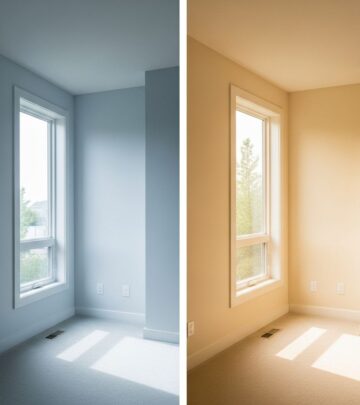
- Natural Lighting: Test color samples on your home’s exterior and view them at different times of day; sunlight dramatically affects paint appearance.
- Permanent Features: Work harmoniously with unpaintable elements like roofing, brick, or stone.
- Balance: Combine body, trim, and accent colors thoughtfully to highlight architectural features without overwhelming the eye.
Timeless Exterior Color Combinations
White With Black Accents
A white exterior with black accents exudes classic sophistication. Imagine crisp white siding paired with inky-black shutters, doors, and lighting for a high-contrast, dramatic look that never goes out of style. This minimalistic combination feels both modern and traditional and suits everything from Colonial and farmhouse styles to sleek contemporaries.
- Main Color: Bright or off-white siding
- Trim/Accent: Deep black for doors and shutters
- Bonus: Add black planters or sconces for graphic impact
Off-White and Ink Black
Take a subtly softer approach with off-white paired with distinguished black. This pairing has a timeless appeal, gently highlighting features like windows and doors with deep black paint while the off-white softens the overall effect. Ideal for both historical homes and modern renovations looking for understated drama.
Charcoal
Charcoal exteriors are bold, moody, and confident. A dark gray or nearly black house hides dirt and blemishes, provides a sleek backdrop for landscaping, and allows contrasting trim, such as crisp white or wood tones, to pop. Charcoal is incredibly versatile, working well on contemporary, rustic, and urban homes alike.
- Main Color: Charcoal gray
- Trim/Accent: White, natural wood, or matte black
- Design Tip: Use bold hardware or house numbers for personality
Warm Gray
If you seek a cross between light and moody, warm gray is a perfect middle ground. This shade offers an inviting, sophisticated look without being too stark or heavy. Warm grays work beautifully with clay roof tiles, wrought iron gates, and lantern lighting, providing a Mediterranean or transitional aesthetic.
Welcoming Yellow and White Combinations
Pale Yellow and White
Pale yellow exteriors with white trim radiate warmth and cheer. This combination is friendly and timeless, often seen on historic homes in coastal regions or southern towns. White on columns, shutters, and window trims provides crisp contrast and classic charm.
Golden Yellow
For a bolder statement, golden yellow injects life and energy into any neighborhood. This vibrant color transforms traditional homes and breathes new life into historic properties, especially when complemented by sophisticated brown or crisp white detailing.
Sunrise Yellow and White
Mediterranean Revival and Spanish-style homes shine with sunrise-inspired yellow and white detailing. The sunny hue is welcoming and cozy, while pure white on ornate moldings or arches draws attention to exquisite craftsmanship.
Eye-catching Blue and Yellow Pairings
Bright Yellow, Blue, and White
Bright yellow and blue are a playfully modern duo—white trim pulls the look together and accentuates unique architectural elements. This combination is ideal for Victorian, coastal, or eclectic homes, evoking a lively and optimistic atmosphere.
| Style | Main Color | Accent | Trim |
|---|---|---|---|
| Coastal Victorian | Imperial Yellow | Bedford Blue (for door and stairs) | Crisp White |
| Spanish Revival | Sunrise Yellow | White | White |
Inviting Earthy Combinations
Forest Green and White
Forest green paired with white creates an immersive, nature-inspired vibe. Use forest green for the upper section of exterior walls, and paint the lower portion white for added brightness and structure. This combination blends beautifully into wooded or rural environments but remains visually interesting and accessible.
Dark Gray-Green
Dark gray-green brings an earthy, tranquil feel to exteriors, especially when paired with wood, natural stone, or even bronze fixtures. This low-key, organic look is ideal for modern or Craftsman homes nestled on wooded lots.
- Main Color: Rock Bottom by Sherwin-Williams (dark gray-green)
- Material Pairing: Walnut, soapstone, oak, marble
- Complement: Simple, natural landscaping
Classic Red, Blue, and Neutrals
Ruby Red and Navy Blue
For a rich, traditional look, pair ruby red brick exteriors with a navy blue door. Accents in white and brownstone create an elegant, timeless façade—easily adaptable to a variety of home ages and styles.
- Body: Ruby red brick
- Main Door: Navy blue
- Trim: White
- Accent: Brownstone entry frame
Unexpected Warm Combinations
Cream and Burnt Orange
Cream and burnt orange echo the warmth of sun-drenched regions, especially stunning on Spanish- and Mediterranean-inspired homes. Use burnt orange for window trim, roofing, or accents to energize off-white walls; lush tropical greenery completes the vibrant picture.
- Main Color: Cream or warm off-white
- Trims/Accents: Burnt orange window trim, rooftops
- Landscape: Lush tropical or desert plants
Expert Tips for Painting Your Home’s Exterior
- Sample First: Always test paint samples on your home and monitor for several days to see how light and weather affect the color.
- Maintain Cohesion: Limit your palette to three main colors—body, trim, and one accent shade—to avoid visual chaos.
- Check HOA Rules: If you live in a community with a homeowners association, confirm any exterior color restrictions.
- Use Durable Finishes: Opt for high-quality exterior paints formulated for durability and weather resistance.
- Don’t Forget the Details: Mailboxes, planters, and even porch ceilings offer opportunities to extend your chosen palette.
FAQs: Exterior Color Combinations
What’s the best exterior color for resale value?
Neutral colors like white, off-white, gray, and beige are generally the safest choices for resale, as they appeal to a broad range of buyers and complement many architectural styles.
How do I pick an exterior color that will look good year-round?
Choose shades that interact well with all seasons of foliage and local lighting. Earthy neutrals, classic grays, and soft whites are reliable, while bolder shades may need strategic landscaping to ensure harmony year-round.
Can I use bold colors on my ranch or midcentury home?
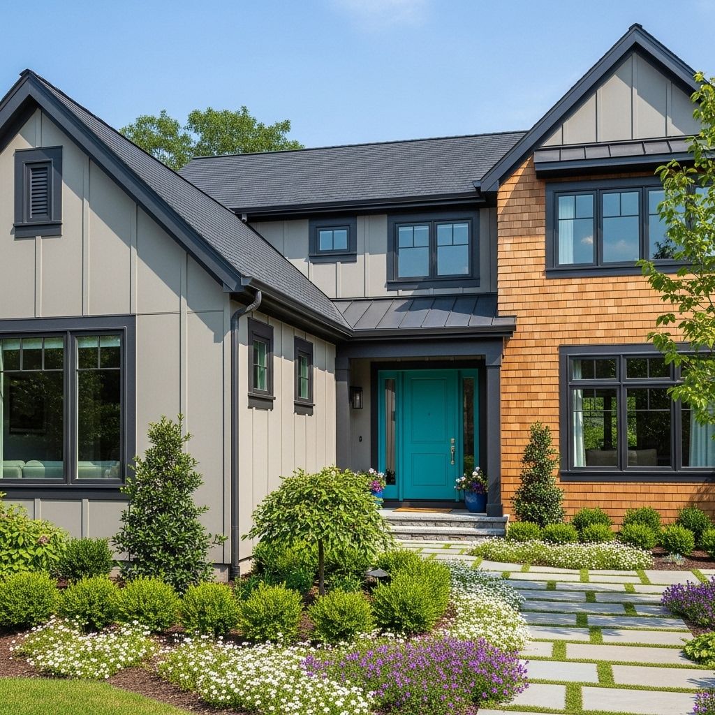
Absolutely! Midcentury and ranch homes can look fantastic with bold accent colors—think turquoise doors, sunny yellow siding, or even deep teal. Keep the body color subtle if you go bold with accents.
Should trim always be lighter than the main exterior?
Not always, but using a lighter trim color typically highlights features and frames the home beautifully. Dark trim can create drama and modern appeal, especially with light main colors.
How do I make a small house look larger with color?
Light shades, such as soft whites or pale grays, reflect more light and visually expand the footprint. Painting trim and accents in the same color family can also elongate lines for a grander impression.
Are there exterior color trends I should avoid?
Avoid highly saturated or “trendy” colors unless you’re sure they complement your home’s style and neighborhood context. It’s best to save experimental shades for doors or planters if you want to play it safe.
Ready to Transform Your Curb Appeal?
From classic white-and-black duos to vibrant yellows and crafted lists of earthy greens, there’s an exterior color combination to elevate every home. Thoughtful pairings not only showcase your personality but also create a lasting impression on guests and passersby. Invest time in planning, testing, and refining your palette to ensure your home’s refreshed look stands the test of time and taste.
References
- https://www.housebeautiful.com/room-decorating/outdoor-ideas/g60581362/exterior-house-colors-design/
- https://www.youtube.com/watch?v=mJxNdXFcviE
- https://www.houzz.com/discussions/6262046/help-with-exterior-paint-colorssiding-trim-heres-a-current-picture
- https://www.youtube.com/watch?v=2rAv-0HAmRU
- https://www.houzz.com/discussions/2493536/help-with-house-exterior-house-colors
Read full bio of medha deb

