Erin Napier’s Most-Used Paint Colors from HGTV’s Home Town
Discover Erin Napier’s favorite paint colors used on HGTV’s Home Town and learn how they create inviting, timeless spaces in every home.

Erin Napier’s Favorite Paint Colors on HGTV’s Home Town
On every episode of HGTV’s Home Town, Erin Napier transforms ordinary homes into inviting sanctuaries full of warmth, nostalgia, and Southern charm. Much of that signature coziness comes from her expertly chosen color palettes, combining neutrals with organic hues and layering them across walls, trim, and cabinetry. If you’re inspired to bring the Home Town look into your own space, start with Erin’s 15 most-used paint colors and her guiding principles for selecting colors that feel both fresh and timeless.
The Essence of Home Town Style
Erin Napier’s approach is rooted in creating rooms that feel lived-in and welcoming, reminiscent of sunny afternoons spent reading or cooking in a warm kitchen. Her expertise in both neutrals and bold colors ensures every room feels cohesive, effortlessly styled, and ready for real-life moments. Whether it’s a cozy corner or a bustling kitchen, Erin’s color choices set the foundation for comfort and nostalgia.
Top 15 Paint Colors Erin Napier Uses Most
These are the go-to paint colors Erin uses to evoke the Home Town aesthetic, each with its own character and unique effect on a space.
- Dover White by Sherwin-Williams: A creamy white that combines the warmth of ivory with the crispness of true white. Used on walls, trim, and doors, it’s Erin’s preferred choice for creating inviting backgrounds that soothe rather than stare.
- Mushroom by Sherwin-Williams: This medium taupe brings cozy contrast to living rooms and is proof that beige is back. Perfect for pairing with lighter trims to create depth without drama.
- Grays Harbor by Sherwin-Williams: A moody yet comforting deep blue-gray ideal for accent walls, trim, or cabinetry. It channels coziness and nostalgia, particularly in small rooms that need visual weight.
- Softened Green by Sherwin-Williams: Inspired by Laurel’s lush landscape, this gentle green reflects the beauty of nature outside and brings tranquility to interiors, echoing the leafy Southern surroundings.
- White Dove by Benjamin Moore: Classic and crisp, White Dove is Erin’s staple for trim, doors, and ceilings. It brightens spaces and feels effortlessly clean.
- Waller Green by Benjamin Moore: Erin uses this aged verdigris-inspired hue on cabinetry, striking a balance between vintage charm and modern sensibility—a nod to historic Southern homes.
- Aurora Brown by Sherwin-Williams: Oranges, rusts, and browns are often overlooked, but Erin’s use of Aurora Brown gives spaces a sense of warmth and earthiness, ideal for adding approachable personality.
- Cotton by Sherwin-Williams: Like a freshly laundered sheet, Cotton offers a creamy white for trims, seamlessly blending with both darker and lighter wall shades.
- Mossy Aura by Valspar: A warm sage reminiscent of dried herbs, this color is perfect beside antique touches, wainscoting, and curated wallpapers.
- Greek Villa by Sherwin-Williams: Need a cheerful, clean reset? Greek Villa’s refreshing white is Erin’s go-to for light-filled walls that need a bright start.
- Netsuke by Sherwin-Williams: Erin’s own Mississippi farmhouse kitchen uses this aged, slightly yellow-white inspired by Downton Abbey, providing lived-in character and vintage appeal.
- Celery Salt by Benjamin Moore: Soft and subtle, this delicate green-gray offers a gentle, nature-inspired undertone to any room.
- Brown Buzz by Valspar: A rich brown with warmth and depth, Brown Buzz introduces history and coziness to floors, wood details, and cabinetry.
- Alabaster by Sherwin-Williams: Frequently chosen for walls and trim, this gentle white never feels cold—always warm and inviting.
- Classic Gray by Benjamin Moore: A perfect soft gray for blending with bolder accents or creating a serene neutral backdrop throughout the home.
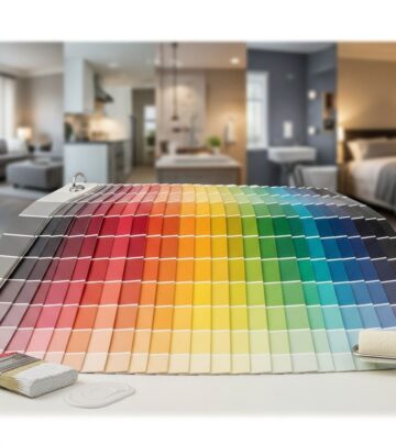
The Power of Neutrals vs. Bold Colors
| Category | Effect | Main Colors | Usage Tips |
|---|---|---|---|
| Neutrals | Provide timelessness and flexibility, making spaces feel larger and light-filled. | Dover White, White Dove, Cotton, Alabaster, Mushroom, Classic Gray | Use on walls, trim, and ceilings; blend with accent colors to maintain warmth. |
| Bold/Nature-Inspired | Add character, depth, and coziness; evoke Southern landscapes and vintage charm. | Grays Harbor, Softened Green, Waller Green, Aurora Brown, Mossy Aura | Feature on accent walls, cabinetry, or in rooms needing statement or nostalgia. |
How Erin Napier Chooses Her Colors
- Look for Lived-In Warmth: Erin emphasizes colors that feel “a little yellow, a little aged,” avoiding stark, cold spaces for those that look homey from the start.
- Cohesive Flow: She often repeats the same color scheme throughout connected rooms, coordinating trim and walls for seamless transitions.
- Inspired by Nature and History: Colors echo Southern landscapes and vintage eras, blending fresh trends with storied tradition.
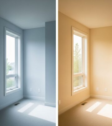
- Testing Lighting: Erin recommends sampling paint in your own home, observing how colors shift with sunlight and artificial light throughout the day.
Signature Spaces Transformed by Erin’s Palette
Every room Erin Napier renovates is crafted for comfort, function, and visual harmony. Her kitchen in Mississippi, for example, channels Downton Abbey charm with honed granite, handcrafted beams, and Netsuke-painted walls. Living rooms become restful havens with Mushroom or Classic Gray, while bedrooms benefit from gentle greens and creamy whites. Bold, earthy colors show up in mudrooms, libraries, and home offices—spurring creativity and conversation.
Quick Tips for Recreating the Home Town Look
- Start Small: Test with sample pots, paint swatches, or accent pieces before committing.
- Mix Neutrals and Colors: Pair bold hues with calming neutrals to avoid overwhelming spaces.
- Consider Function: Lighter colors work well in busy family areas; bold colors anchor studies, dining rooms, or places needing personality.
- Use Texture and Material: Complement painted surfaces with rustic wood, textiles, and vintage details for a layered feel.
- Repeat and Balance: Carry a main color from one room’s trim to another’s wall for effortless flow.
Real-Life Inspiration: Erin’s Mississippi Farmhouse
When renovating her own farmhouse, Erin wanted a kitchen that felt “like a million recipes have already been cooked.” She chose Netsuke by Sherwin-Williams, inspired by Mrs. Patmore’s kitchen in Downton Abbey, as a warm, aged white that feels intimate and historic. Surrounding elements—dark granite, handcrafted beams, wood floors—work in harmony to evoke classic English country style. Erin’s process exemplifies how thoughtful color choices enrich the stories homes tell, making each space uniquely welcoming.
15 Most-Used Erin Napier Paint Colors At-A-Glance
| Paint Color | Brand | Ideal Usage | Style Effect |
|---|---|---|---|
| Dover White | Sherwin-Williams | Walls, trim, doors | Creamy, warm background |
| Mushroom | Sherwin-Williams | Living rooms, dining | Comforting taupe, cozy feel |
| Grays Harbor | Sherwin-Williams | Accent walls, trim | Moody and nostalgic |
| Softened Green | Sherwin-Williams | Bedrooms, kitchens | Natural, calming |
| White Dove | Benjamin Moore | Trim, doors, ceiling | Crisp, classic white |
| Waller Green | Benjamin Moore | Cabinetry | Nostalgic, aged verdigris |
| Aurora Brown | Sherwin-Williams | Walls, trim | Earthy warmth |
| Cotton | Sherwin-Williams | Trim, walls | Creamy, clean |
| Mossy Aura | Valspar | Wainscoting, wallpaper pairing | Sage, antique inspiration |
| Greek Villa | Sherwin-Williams | Walls | Cheerful, refreshing white |
| Netsuke | Sherwin-Williams | Kitchen walls | Warm, aged white-yellow |
| Celery Salt | Benjamin Moore | Accent walls, trim | Soft, nature-inspired |
| Brown Buzz | Valspar | Flooring, woodwork | Rich, historical brown |
| Alabaster | Sherwin-Williams | Walls, trim | Gently warm white |
| Classic Gray | Benjamin Moore | Walls | Serene, neutral |
Frequently Asked Questions (FAQs)
Q: What is the most popular Erin Napier paint color for trim?
A: Dover White by Sherwin-Williams and White Dove by Benjamin Moore are Erin’s top choices for trim because they offer a warm yet fresh backdrop to any color scheme.
Q: How does Erin Napier achieve a cohesive look throughout the home?
A: Erin often repeats key colors in connected areas, using a single shade on walls in one room and transitioning it to trim or cabinetry in the next for seamless visual flow.
Q: Which Home Town paint color works best for kitchens?
A: Erin loves Netsuke by Sherwin-Williams, a soft, aged white-yellow that makes kitchens feel vintage and lived-in. She also uses greens and taupes for cabinetry and accents.
Q: Are bold colors used frequently in Erin’s designs?
A: While Erin is renowned for her neutrals, she often incorporates bold hues like Grays Harbor, Waller Green, and Aurora Brown to anchor rooms and add character.
Q: How should I test a paint color before committing?
A: Erin recommends painting a small section of wall or using sample pots to ensure the color’s undertones and vibrancy work with your home’s lighting and décor.
Q: What’s the benefit of pairing bold colors with neutrals?
A: Mixing bold colors with neutrals keeps rooms harmonious and allows vibrancy without overwhelming the space—a trademark strategy in Erin’s Home Town designs.
Bring the Home Town Palette to Your Home
Erin Napier’s most-used paint colors draw from nature, history, and everyday Southern life. By choosing lived-in neutrals, echoing natural greens, or experimenting with rich browns and blues, you can create rooms that feel both stylistically timeless and personally meaningful. Whether renovating a farmhouse or simply updating a single room, let Erin’s Home Town palette guide you toward a space of comfort, beauty, and story-filled warmth.
References
- https://www.countryliving.com/life/entertainment/a61828265/hgtv-home-town-erin-napier-kitchen-paint-color/
- https://www.countryliving.com/home-design/color/a64163247/erin-napier-paint-colors-home-town/
- https://www.laurelmercantile.com/blogs/journal/the-home-town-look-use-bold-colors
- https://www.laurelmercantile.com/blogs/journal/my-favorite-colors
- https://www.countryliving.com/home-design/color/g64543047/no-regret-paint-colors/
- https://www.countryliving.com/home-design/color/
Similar Articles
Read full bio of medha deb