How Contrast Trim Paint Transforms Any Room
Discover the designer-endorsed paint trick—contrast trim—that makes your space pop with minimal effort and cost.

Contrast trim is a tried-and-true paint strategy employed by designers to inject color, character, and visual structure into any space—all for the price of a single gallon of paint. This technique focuses on highlighting millwork by painting it a noticeably different hue than the walls, opening a world of creativity while substantially boosting a room’s style quotient.
What Is Contrast Trim?
At its core, contrast trim refers to the practice of painting the decorative wood trim in a space—think baseboards, crown molding, door frames, window casings, wainscoting, and even built-in cabinetry—a color that is distinctly different from the walls. Instead of defaulting to the familiar approach of white or a subtle variant thereof, contrast trim encourages bold choices that make architectural details stand out, creating a high-impact, designer-approved effect.
- Millwork includes: Baseboards, crown molding, window and door trim, chair rails, picture rails, built-ins, wainscoting, fireplace mantels, and stair risers.
- Traditional approach: Most often, trim and walls have been painted white or shades only slightly more saturated than the wall color.
- With contrast: Vibrant, deep, or unexpected hues for the trim amplify the room’s personality and draw the eye to architectural features.
By intentionally breaking from the norm and painting trim with deliberate contrast, even the simplest architectural details gain new importance and vigor.
Why Designers Love Contrast Trim
So why has contrast trim become a favorite designer trick? In large part, it’s because paint is the great equalizer of the design world—no major renovation or splurge is required to achieve big impact. Here’s why experts turn to contrast trim:
- Affordable transformation: A gallon of paint costs little compared to furniture or architectural work, yet delivers a dramatic effect with nothing but time and a brush.
- Maximizes existing features: Even builder-grade or dated trim becomes a standout element when painted in a stunning shade.
- Personalizes a space: Colorful trim lets you express your style without overwhelming the entire room.
- Adds structure and definition: Especially in large or minimally furnished rooms, contrast trim visually organizes and delineates spaces.
- Enhances color stories: When coordinated with the palette of furnishings, rugs, or art, contrast trim can unify or boldly complement the room’s design narrative.
How to Choose a Contrast Trim Color
Selecting a contrast trim color may seem daunting, but there are proven strategies that simplify the process and ensure a cohesive look. The key is to make an intentional, visible break from both subtle matching and default white.
1. Pull From the Existing Palette
Start by surveying your room’s current colors: upholstery, area rugs, drapery, wall art, or wallpaper. Choose a shade that is already present in one of these elements. This technique ensures the trim color “belongs” in the space without introducing visual discord.
- If your rug features a navy blue border, consider echoing that blue on the trim.
- Does your wallpaper have olive or forest green details? That could be the trim shade that ties everything together.
- Pulling from existing colors is especially useful when aiming for coherence, not just impact.
2. Use the Color Wheel
When in doubt, designers often recommend consulting the color wheel. The approach is straightforward:
- Identify the dominant color of your walls.
- Look directly across the wheel to find its complementary (opposite) color.
- A true contrast, such as deep green trim against soft blush walls, will always create an eye-catching result.
This time-honored technique, rooted in art class basics, is virtually foolproof and works whether your walls are neutral or boldly colored.
3. Avoid Neutrals for Trim
The fundamental “contrast” effect hinges on picking a hue that is obviously distinct from both the wall color and standard trim choices (white, gray, or barely-there shades). Opt for strong, saturated, or dark colors for the trim—navy, hunter green, oxblood, teal, ochre, nearly-black, or even rich yellow can all be transformative.
4. Experiment With Finishes
The finish matters as much as the color. Paint the contrast trim in a slightly glossier finish (such as semi-gloss or satin) relative to the walls (usually eggshell or matte). This not only makes the color pop but also adds durability to trim surfaces that get more wear. Variations in sheen subtly highlight the millwork’s surfaces and curves.
Inspirational Ideas and Lived-In Examples
The real beauty of contrast trim is its versatility. Here are some inspiring approaches and settings where contrast trim can work its magic:
Entryways and Hallways
- Deep blue door frames lead guests into the main living space, making entrances feel curated and intentional.
- Crisp teal baseboards carve out structure in narrow hallways, guiding the eye along the architectural line.
Kitchens
- Rich forest green trim around cabinetry and wainscoting creates a country-inspired kitchen, especially when paired with soft white walls.
- Try nearly-black or charcoal gray on window casings for a modern farmhouse look, complementing wooden floors and open shelving.
Living Rooms
- Sunny yellow or ochre painted crown molding brings warmth, energy, and a touch of the unexpected to rooms with pale gray or neutral walls.
- Oxblood or burgundy trim provides a sense of drama in formal sitting areas or dens, especially when echoed in textiles or art.
Bedrooms
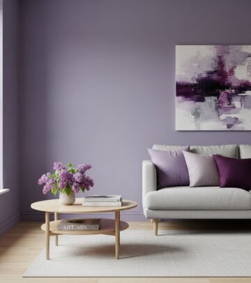
- Pale blue or blush pink trim transforms a bedroom into a whimsical retreat, pairing sophistication with softness.
- For something bolder, hunter green trim anchors rooms with floral wallpaper or botanical prints.
Children’s Rooms and Playrooms
- Bright, primary shades like red, yellow, or grass green spark creativity and fun, resulting in cheerful, lively spaces.
Built-Ins, Bookcases, and Cabinets
- Painting just the interior trim of bookcases or cabinet framing in a distinct color frames collections and adds visual intrigue, even among neutrals.
Bathrooms and Laundry Rooms
- Cobalt or peacock blue trim amps up energy in compact spaces.
- Even beadboard or wainscoting painted a step or two deeper than the wall provides instant dimension.
Contrast Trim Inspiration Table
| Room | Wall Color | Recommended Contrast Trim |
|---|---|---|
| Entryway | Soft White | Classic Navy or Hunter Green |
| Kitchen | Cream or Pale Gray | Forest Green, Charcoal, or Nearly-Black |
| Living Room | Light Taupe | Oxblood, Ochre, or Deep Blue |
| Bedroom | Blush Pink | Pale Blue or Soft Jade |
| Child’s Room | Butter Yellow | Primary Red or Bright Grass Green |
| Bathroom | Mint Green | Peacock Blue or Crisp Teal |
Pro Designer Tips for Flawless Contrast Trim
While contrast trim looks effortless, a few time-honored tips from pros ensure your paint project feels deliberate and elevated:
- Test samples: Always put paint swatches on both the wall and trim to view how they interact in your room’s unique light at different times of day.
- Mind undertones: Make sure undertones are in harmony (avoid clashing cool and warm undertones between wall and trim colors).
- Sheen hierarchy: A glossier finish for trim than for walls intensifies the effect and resists wear.
- Balance the bold: In open-concept spaces, repeat the trim color in small accents—think pillows, vases, or art—to tie rooms together.
- Prep is paramount: Prime trim and repair imperfections before painting so colors appear crisp and professional.
Common Millwork Applications for Contrast Trim
You don’t need ornate woodwork to use contrast trim; even contemporary homes with clean lines can benefit. Trim elements often painted with contrast include:
- Baseboards
- Window and Door Casings
- Chair Rails
- Crown Molding
- Wainscoting Paneling
- Stair Risers and Banisters
- Fireplace Mantels
- Builtin Bookcases and Cabinets
When millwork is painted a bold color, it highlights these architectural features, lending even newer construction homes the character of a historic or custom build.
The Power of Paint: An Equalizer in Design
Whether your home is a century-old farmhouse or a brand new condo, the beauty of contrast trim is accessibility. Even premium or designer paint brands offer prestige, yet true impact comes from color choice and placement, not the price tag on the can. In fact, some of the most dramatic and memorable rooms achieve their visual magic with little more than thoughtful color contrasts and strategic application.
Frequently Asked Questions (FAQs)
What exactly counts as ‘trim’ for contrast painting?
Trim includes all decorative woodwork—baseboards, window and door casings, crown molding, chair rails, wainscoting, stair risers, picture rails, and even built-in cabinetry or shelving frames.
Do I have to use dark colors for contrast trim?
No, but the contrast should be noticeable—if the walls are pale, a mid-tone or deeply saturated color works well. You can also invert the usual scheme: use a light or bright trim with dark walls for equal impact.
How do designers select the right finishes?
Designers recommend a glossier sheen (semi-gloss or satin) for trim than for walls. This highlights the trim, makes it easier to clean, and helps prevent scuffs.
What mistakes should beginners avoid?
Avoid trim colors that are too similar to the walls, clashing undertones, poor surface prep, or mismatched paint sheens. Test options before starting, and don’t be afraid of color—contrast is the point!
Does contrast trim work in small rooms?
Absolutely! In fact, the well-placed contrasting trim in bathrooms or entryways can visually expand boundaries and add style even without expensive decor or extensive square footage.
How do I ensure my contrast trim feels timeless?
Balance trend-driven shades with classic combinations from your existing decor, and use the color for continuity—repeat it in upholstery, art, or accessories elsewhere for a harmonious look.
Conclusion: Elevate Your Space the Simple Way
Contrast trim is more than a passing trend—it’s a practical, designer-endorsed tool for infusing color, enhancing architectural drama, and maximizing the character of any home. Armed with a brush, the right shade, and a keen eye, you can revitalize your interiors and shape a custom look, no renovation necessary. Let your trim—and your creative spirit—guide the way to your dream room.
References
- https://www.countryliving.com/home-design/color/a64760210/contrast-trim-paint-ideas/
- https://www.youtube.com/watch?v=XsZ5GKl6Pzw
- https://modernnesthomes.com/the-english-country-paint-colors/
- https://www.countryliving.com/home-design/decorating-ideas/g4263/rustic-farmhouse-kitchen-ideas/
- https://withwonderandwhimsy.com/2025/06/12/english-country-living-room-ideas/
Similar Articles
Read full bio of Sneha Tete