Butter Yellow: The Sunshine Trend Transforming Homes in 2025
Butter yellow is reimagining interiors in 2025, offering warmth, cheer, and timeless style—a trend with broad appeal and staying power.

Every so often, a color emerges that perfectly captures the mood of an era. In 2025, butter yellow is that color—the hue infusing interiors with a sunny optimism and gentle warmth that’s instantly inviting. Its emergence in home design is more than a fleeting fad; it’s a signpost for the times, reflecting our collective craving for comfort, positivity, and timeless style. From paint to upholstery, accessories to art, butter yellow is basking in the design spotlight. But what lies behind this surge in popularity, and how can you use it to transform your own home? Read on for a deep dive into the trend that’s making everyone crave a little more sunshine indoors.
What Is Butter Yellow?
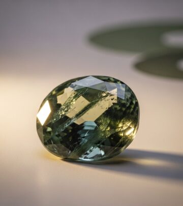
Butter yellow is a pale, soft yellow tone, reminiscent of fresh creamery butter. This delicate shade threads the needle between pastel yellows and more vibrant hues, offering a subtle version of yellow with just the right amount of warmth and light. Interior designers describe it as a hue that’s “neutral yet cheerful,” evoking the look of sunlight filtering through sheer curtains or the gentle glow of early morning. Unlike brighter applicants of yellow—like bold lemon or punchy mustard—butter yellow is restrained and mellow, making it versatile in both modern and traditional spaces.
- Color family: Soft, creamy yellow with a neutral undertone
- Visual effect: Reflects light gently, making spaces feel sunnier and more spacious
- Ambiance: Cheerful, comforting, calming—never harsh
Why Is Butter Yellow Trending in 2025?
The meteoric rise of butter yellow is no accident. This hue has swept across high fashion, leading interior paint collections, and even art licensing, thanks to both its visual appeal and emotional resonance. In contrast to the stark whites and cold greys of minimalism, butter yellow represents a return to warmth and human connection in home design. According to designers, its popularity boils down to a few key factors:
- Optimism and Happiness: Yellow has always been linked to sunshine and positivity. Butter yellow harnesses these associations without the intensity of brighter shades, offering a subtle lift that’s easy to live with.
- Comfort and Calm: This is a post-pandemic comfort color. Butter yellow gently soothes, softens spaces, and provides a feeling of safety and reassurance. It’s neither too bold nor too dull.
- Timelessness: Designers agree butter yellow never really goes out of style. Its gentle tones feel sophisticated yet playful, making it a perennial favorite that won’t date or tire quickly.
- Versatility: This hue acts as both a neutral and a feature color. It pairs seamlessly with other colors, from earthy greens and powder blues to natural woods and soft greys, making it a chameleon in any design scheme.
- Cross-Category Appeal: Butter yellow’s charm extends from fashion runways (notably seen in collections by Chloé and Givenchy) to interior walls, textiles, and decorative accessories, reflecting a broader color trend embracing playfulness and serenity.
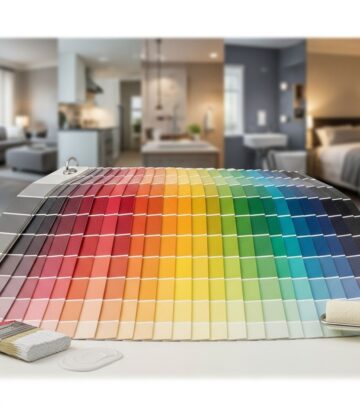
Butter Yellow vs. Other Yellows: What Sets It Apart?
| Type | Tone | Effect | Best Use |
|---|---|---|---|
| Butter Yellow | Soft, creamy, slightly muted | Calming, warming, subtle light | Walls, furniture, accents, textiles |
| Lemon Yellow | Bright, zesty, vibrant | Energetic, stimulating, bold | Pops of color, modern accents |
| Mustard Yellow | Rich, earthy, deep | Retro, autumnal, dramatic | Feature walls, vintage themes |
| Pale Pastel Yellow | Light, cool, pale | Fresh, airy, minimal | Children’s rooms, spring accents |
Butter yellow’s real distinction lies in its balance: not too sugary, not too dull. It offers a gentle uplift without dominating the room, unlike lemon, or feeling weighty, like mustard.
How to Use Butter Yellow in Your Home
Whether you’re planning a complete redesign or just want to freshen up your space, butter yellow’s versatility means there are endless ways to incorporate it into your home. Here’s how designers are using this color right now—and why you might want to take note.
1. Walls and Paint
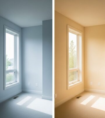
Butter yellow paint makes rooms feel larger and brighter by bouncing natural light around. It’s an ideal backdrop in living rooms, bedrooms, kitchens, and even bathrooms. Unlike bolder yellows, its neutrality prevents spaces from feeling overwhelming.
- Works especially well in north-facing rooms that lack natural light
- Combines beautifully with white trim or natural wood moldings
- Softens the lines of modern architecture, adding warmth to minimalist spaces
2. Furniture
If you’re not ready for a full paint job, choose butter yellow furniture to introduce warmth and a hint of playfulness. This could mean a velvet armchair, upholstered headboard, or even a vintage-inspired sofa. The color imbues the furniture piece with personality, serving as a conversation starter without dominating the overall palette.
3. Textiles and Accessories
For a subtler touch, layer butter yellow through textiles: throws, cushions, rugs, curtains, and bedding. These elements can be easily swapped or reimagined as your style evolves, making them perfect for seasonal updates or rented homes. Pair with complementary colors—think sage green, dove grey, or blush pink—for a cohesive look.
4. Kitchens and Dining Spaces
In the kitchen, butter yellow brings a vintage, sun-dappled charm. Picture painted cabinets, ceramic dishware, or patterned table linens. In an open-plan space, it provides subtle zoning by delineating cooking and eating areas without the need for walls. The color stimulates appetite and conversation—ideal for family gatherings and friendly brunches.
5. Bathrooms and Powder Rooms
Used in smaller spaces, butter yellow is remarkably effective at making bathrooms and powder rooms feel bright and inviting. Opt for glossy tiled walls, painted vanities, or framed art prints that reference this sweet shade. Paired with brass fixtures, the effect is both classic and contemporary.
6. Art and Wall Decor
From abstract prints to botanical wallpapers, butter yellow is emerging as a favorite for wall art and pattern design. Its gentle energy ties in seamlessly with interiors of varying styles, from maximalist to minimalist. Try a gallery wall with yellow-accented prints or a statement wallpaper featuring swirling butter yellow motifs.
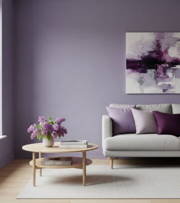
Pairing Butter Yellow: The Designer’s Palette
Butter yellow’s secret weapon is its ability to partner with a rich spectrum of shades. Here are some winning combinations favored by interior stylists:
- Sage, Olive, and Emerald Greens: For a natural, refreshing vibe
- Pale Blues and Navy: Creates crisp contrast for a modern finish
- Warm Neutrals: Ecru, taupe, sand, and warm whites offer subtle sophistication
- Earthy Reds and Terracottas: Add coziness and retro appeal
- Blush and Rose: Adds a soft, feminine elegance
Designers also note that butter yellow tempers bolder prints or large-scale patterns, ensuring even ‘busy’ rooms feel inviting and grounded.
Butter Yellow Across Design Styles
- Modern Minimalism: Adds warmth to otherwise stark spaces, softening hard edges
- Mid-Century and Vintage: Echoes the color palettes of retro kitchens, classic cars, and beloved ceramics, enhancing nostalgic charm
- Traditional Settings: Enriches layered patterns and textures, especially with dark wood
- Scandinavian Design: Infuses light-infused, neutral rooms with an extra boost of harmony
Its cross-genre appeal ensures it’s equally at home in city apartments, cozy cottages, and sprawling country estates.
The Psychological Power of Butter Yellow
It isn’t just about aesthetics—color psychology plays a major role in butter yellow’s ascent. Experts cite its impact in boosting mood, promoting feelings of joy, comfort, and creativity, and even increasing perceived space. In periods of uncertainty and collective craving for comfort, this shade resonates deeply with those seeking sanctuary at home.
Will Butter Yellow Stay in Style?
While some color trends are short-lived, the design consensus is that butter yellow has true staying power. Its nuanced undertones offer flexibility for changing tastes, while its timeless appeal ensures it can be layered or paired with evolving palettes over the years. In short: this trend has legs, with experts predicting its popularity will last through 2026 and beyond.
Frequently Asked Questions (FAQs)
Q: Is butter yellow suitable for every room?
A: Yes. Butter yellow’s soft tone adapts to living rooms, kitchens, bedrooms, bathrooms, and even utility spaces. Its neutral character avoids overwhelming small rooms, and its warmth makes larger spaces feel cozy.
Q: What colors go best with butter yellow?
A: Sage green, light blue, terracotta, taupe, blush, and navy all complement butter yellow beautifully. Use bolder hues as accents or stick with neutrals for a serene effect.
Q: Can I use butter yellow in a modern or minimalist home?
A: Absolutely. The key is moderation—use butter yellow as a feature (such as an accent wall or statement chair) against a palette of whites, greys, and muted tones to highlight its warmth without cluttering the space.
Q: How do I prevent butter yellow from feeling too ‘country’ or old-fashioned?
A: Combine it with contemporary furniture lines, clean geometric prints, or metallic finishes. Contrast with darker colors or deep blues for a more urban, sophisticated feel.
Q: Is this a good choice for renters or those on a tight budget?
A: Definitely. Butter yellow can be added through inexpensive accessories—cushions, throws, art, or even peel-and-stick wallpaper. It’s a cost-effective way to update a space without major renovation.
Expert Tips for Styling with Butter Yellow
- Use layering: Mix different shades and textures for added dimension (think a butter yellow throw on a pale yellow chair).
- Break up large sections of color with natural materials like wicker, light wood, or stone for a grounded look.
- Balance with black or navy for contrast and contemporary flair.
- Mix vintage and modern elements—butter yellow works as a bridge between eras.
- Let natural light do its job: This color comes alive with sunlight, making it ideal for spaces with big windows or skylights.
Conclusion: Butter Yellow—The Sweetest Trend for a Brighter Home
Butter yellow is more than just a pretty shade—it’s an emotional reset. In a design landscape increasingly shaped by the need for comfort, warmth, and happiness, it provides all three in spades. Whether your style is traditional or cutting-edge, cottagecore or cosmopolitan, this sun-washed hue slips in effortlessly, inviting you to savor simple joys and brighter days ahead. Don’t be surprised when you spot butter yellow not only in homes but also in the fashion world, on tableware, artwork, and curated accessories. Embrace the trend and find out just how transformative a touch of butter yellow can be.
References
- https://wildapple.com/butter-yellow-art-licensing-hottest-home-decor-color-trend/
- https://www.homesandgardens.com/interior-design/what-colors-are-replacing-butter-yellow
- https://www.womanandhome.com/homes/homes-news/butter-yellow-decor-trend/
- https://www.realtor.com/advice/home-improvement/butter-yellow-paint-color-room-options/
- https://www.countryliving.com/home-design/decorating-ideas/a65253826/unexpected-yellow-theory/
- https://newgateworld.com/blogs/style/why-butter-yellow-is-the-colour-you-need-to-know-about-for-2025
- https://www.portmeirion.co.uk/stories/post/butter-yellow-the-sweetest-trend-for-2025
Similar Articles
Read full bio of medha deb