The 50 Best Neutral Paint Colors to Freshen Up Your Home
Discover warm whites, universal greiges, and cozy browns—neutral paint colors for every room, style, and budget.

When it comes to painting your home, choosing the right color can be a daunting process. Neutral paint colors, with their versatility and timeless appeal, remain favorites for homeowners and designers alike. From crisp whites and gentle creams to understated browns and universal greiges, neutrals can breathe new life into any room. They infuse spaces with warmth, sophistication, or calm and effortlessly pair with a variety of decor styles, making them the go-to for every project.
What Are Neutral Paint Colors?
Neutral paint colors are shades that do not command attention or compete with the primary colors in your design scheme. These hues—including whites, creams, beiges, grays, and browns—blend seamlessly with most furnishings and serve as subtle backgrounds that make statement pieces pop. Whether you’re seeking an inviting living room, a serene bedroom, or a harmonious kitchen, neutral colors offer unmatched flexibility.
Why Choose Neutral Paints?
- Timelessness: Neutrals rarely go out of style, ensuring your home stays fresh for years to come.
- Versatility: They work with both modern and traditional aesthetics.
- Flexibility: Easy to update with accent colors and decor changes.
- Cohesiveness: Suitable for open floor plans, creating visual unity throughout the home.
How to Pick the Perfect Neutral
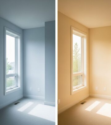
According to color researcher Cynthia Cornell, “Neutral colors are the perfect tone to blend in and make other colorful pieces stand out, because they aren’t complicated.” She recommends starting by identifying the main color or focal point in a space, such as a bold bedspread or an eye-catching couch, and then choosing a neutral shade that complements it. Always test paint samples in your space—lighting and surroundings significantly impact the color’s appearance.
Warm Neutral Paint Colors
Warm neutral colors radiate comfort and coziness. These are favorites in living rooms, kitchens, and bedrooms, where you want a welcoming, lived-in feel. Their undertones often feature yellow, red, or brown, creating a sense of warmth and intimacy.
Top Warm Neutral Paint Colors
- Cream in My Coffee by Valspar
- Pearly Cotton by Magnolia
- Bone White by PPG Paints
- Porcelain by Sherwin-Williams
- Sonnet by Benjamin Moore
- Swiss Coffee by Valspar
- Skimmed Milk by Farrow & Ball
- Natural Linen by Sherwin-Williams
- Spanish Sand by Behr
- Ivoire by Sherwin-Williams
- Farm Fresh Eggs by Valspar
- Pink Floss by Dutch Boy
- Summer Wheat by Glidden
- Pony Tail by PPG Paints
- Cargo Pants by Sherwin-Williams
- Herbal Wash by Sherwin-Williams
- Roosevelt Taupe by Benjamin Moore
These shades offer a spectrum of gentle warmth, ideal for adding softness to any space. For instance, “Swiss Coffee” is widely celebrated for its adaptability—it’s neither too warm nor too cool, making it superb for a serene backdrop. “Natural Linen” evokes the comfort of well-loved fabrics, while “Cream in My Coffee” delivers a creamy touch perfect for kitchens and dining areas.
Cool Neutral Paint Colors
Cool neutrals introduce sophistication and calm. In rooms with abundant natural light, they lend a crisp, refreshing vibe. These colors typically include undertones of blue, green, or violet and work beautifully in bathrooms, bedrooms, or minimalist living spaces.
Top Cool Neutral Paint Colors
- Snowbelt by Sherwin-Williams
- True White by Magnolia Home
- Borrowed Light by Farrow & Ball
- Ashwood by Dunn-Edwards
- Celadon by Behr
- Shaded White by Farrow & Ball
- Light French Gray by Sherwin-Williams
- Hikers Paradise by PPG Paints
- PPG Husky Gray by Glidden
- Wedding Band by Magnolia
- Silver Lining by Benjamin Moore
- Moon Beam by Dutch Boy
- Brewster Gray by Benjamin Moore
- Chocolate Milk by Dunn-Edwards
- Afternoon Drizzle by Clark + Kensington
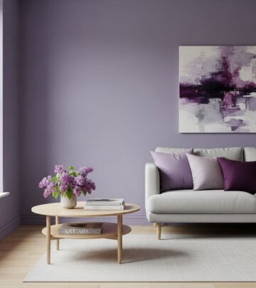
- Purple Cream by Benjamin Moore
- PPG Whiskers by Glidden
Benjamin Moore’s color and design expert, Hannah Yeo, emphasizes the importance of undertones: “The key to successfully choosing a perfect neutral is to understand its undertone. Every room gets a unique mix of lighting, neutrals can quickly shift from being too warm to too cool.” Careful sample testing is crucial as a color can appear dramatically different depending on your space’s lighting and decor.
| Shade | Type | Style Inspiration |
|---|---|---|
| Swiss Coffee | Warm Neutral | Farmhouse, Transitional, Traditional |
| Light French Gray | Cool Neutral | Minimalist, Contemporary, Modern |
| Bone White | Warm Neutral | Classic, Cozy, Inviting |
| Silver Lining | Cool Neutral | Elegant, Soft, Airy |
| Roosevelt Taupe | Warm Neutral | Timeless, Rustic, Farmhouse |
Universal Greiges: The Ultimate Flexibility
Greige—a blend of gray and beige—is celebrated for being the ultimate chameleon. These shades offer both warmth and coolness depending on the lighting, providing a sophisticated neutral foundation for any space. Greige works especially well in homes aiming for a modern yet inviting atmosphere.
- Sonnet by Benjamin Moore
- Herbal Wash by Sherwin-Williams
- Pony Tail by PPG Paints
- Light French Gray by Sherwin-Williams
These colors are favored in living rooms, hallways, and large shared spaces where adaptability and coherence are desired. Because greige fits seamlessly with a wide array of accent colors—fiery reds, gentle blues, or earthy greens—it’s often recommended by designers as a “safe but stylish” choice.
Expert Tips for Using Neutral Paints
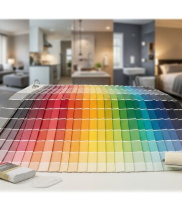
- Sample Several Shades: Always test 2-3 samples on your wall in different lighting conditions before making a final decision.
- Consider Undertones: Pay attention to subtle undertones (yellow, blue, pink, green) as they can impact the room’s overall feel.
- Layer Neutrals: Don’t be afraid to combine different neutrals in one space for depth—pair a warm wall color with cool trim or accent furniture.
- Update with Décor: Neutrals are the perfect backdrop for colorful artwork, textiles, and accessories, allowing you to change themes without repainting.
Room-by-Room: Best Neutrals for Every Space
- Living Room: Opt for creamy whites or soft taupes to create a welcoming environment.
- Bedroom: Choose gentle grays and beiges that promote restfulness and relaxation.
- Kitchen: Crisp whites and warm creams help spaces feel clean and expansive.
- Bathroom: Cool grays or tranquil blue-greiges evoke spa serenity.
- Entryway/Hallway: Greiges unify spaces and effortlessly coordinate with varied décor.
Frequently Asked Questions (FAQs)
Q: Are neutral paint colors just shades of white?
A: Neutral colors encompass a broad palette, including whites, creams, beiges, taupes, browns, grays, and greiges. Each offers its own unique undertones and versatility for different rooms and design aesthetics.
Q: How do I choose between warm and cool neutrals?
A: Consider your room’s lighting and the vibe you wish to create. Warm undertones bring coziness, while cool undertones add tranquility and freshness. Always test samples in your space before committing.
Q: Is greige a safe paint choice?
A: Greige is widely regarded as a safe and stylish option. Its blend of gray and beige provides both warmth and sophistication, adapting easily to any decor or lighting scheme.
Q: How do I prevent neutral walls from feeling bland?
A: Layer neutral tones with colorful accessories, textured fabrics, and bold statement pieces to infuse character and depth into the space.
Q: Which neutral paint is best for resale value?
A: Light, universally appealing shades such as “Swiss Coffee,” “Silver Lining,” and “Bone White” are excellent choices for maximizing resale potential, as they attract a broad array of buyers.
Designer-Approved Neutral Paint Colors
- White Dove by Benjamin Moore: Praised for its creamy yet crisp quality, perfect for any room.
- Tricorn Black by Sherwin-Williams: Adds dramatic contrast, often used on doors and trim.
- Dark Chocolate by Benjamin Moore: Rich, true brown for grounding a space.
- Silver Lining by Benjamin Moore: A designer go-to for blue-tinged elegance.
Quick Tips for a Flawless Neutral Palette
- Test paint samples in both natural and artificial light.
- Pair neutrals with varied textures—wood, linen, stone—for interest.
- Use accent walls or trim to subtly highlight architectural features.
- Don’t fear adding pops of color with pillows, throws, and artwork.
Summary: Embracing the Power of Neutral Paints
Neutral paint colors are not merely a safe bet—they are a transformative tool. With the right shades, your home can transition between moods and styles while always feeling inviting. By understanding undertones, testing samples, and layering textures, you’ll craft spaces that remain contemporary, comfortable, and effortlessly chic. The 50 top picks in this guide offer a comprehensive starting point for any design journey, ensuring each room becomes exactly as vibrant or serene as you envision.
References
- https://www.countryliving.com/home-design/color/a30140287/best-neutral-paint-colors/
- https://modernnesthomes.com/the-english-country-paint-colors/
- https://www.countryliving.com/home-design/color/g64543047/no-regret-paint-colors/
- https://www.aol.com/articles/benjamin-moore-announces-2026-color-160500182.html
Similar Articles
Read full bio of Sneha Tete