Best Green Paint Colors to Transform Your Home
Discover timeless green paint shades that bring life to every room

Green paint has evolved from a trendy, avant-garde choice to an enduring classic in the world of interior design. Once considered bold and unconventional, these nature-inspired hues have firmly established themselves as versatile staples that work beautifully in country homes and modern spaces alike. Whether you’re looking to create a serene sanctuary or add dramatic depth to your interiors, green offers an impressive spectrum of possibilities that can elevate any room.
The beauty of green paint lies in its incredible versatility and its ability to connect indoor spaces with the natural world outside. From whisper-soft sages that create calming retreats to bold hunter greens that make powerful design statements, there’s a perfect shade of green for every aesthetic preference and architectural style. These designer-approved colors have proven their staying power, transcending fleeting trends to become timeless choices that homeowners can confidently embrace for years to come.
Why Green Paint Colors Have Become Design Classics
The journey of green paint from trendy accent to timeless classic reflects a broader shift in how we think about color in our homes. Green’s connection to nature makes it inherently soothing and restorative, qualities that have become increasingly valued in home design. Unlike colors that feel dated after a few years, the right green paint colors possess an enduring quality that works across different design eras and styles.
Green’s versatility stems from its position on the color wheel, sitting between warm yellows and cool blues. This unique placement allows green to take on different characteristics depending on its undertones. Greens with yellow undertones feel warm and inviting, perfect for creating cozy spaces, while blue-green shades offer a cooler, more sophisticated atmosphere. Gray-green combinations deliver subtle elegance, making them ideal for those who want color without overwhelming boldness.
Soothing Gray-Green Shades for Calming Spaces
Gray-green paint colors represent the perfect marriage of sophistication and serenity. These muted tones bring a sense of calm to hardworking spaces like sculleries, mudrooms, and laundry areas where peace of mind is particularly valuable. The addition of gray tempers green’s natural vibrancy, creating a restrained palette that feels both contemporary and timeless.
In spaces where daily chaos reigns, soothing gray-green walls can transform the atmosphere entirely. These colors work exceptionally well in rooms with abundant natural light, where they can shift subtly throughout the day. Morning light brings out their cooler qualities, while afternoon sun warms them up, creating an ever-changing backdrop that never feels static or boring.
French Gray by Farrow & Ball exemplifies this category beautifully. This sophisticated shade brings harmony to busy spaces while maintaining enough color interest to feel intentional rather than neutral. When used on both walls and ceilings, it creates an enveloping effect that makes rooms feel cohesive and thoughtfully designed. The key to working with gray-greens is ensuring your space has adequate lighting—natural or artificial—to prevent them from feeling too cool or flat.
Deep Hunter Green for Dramatic Impact
When you’re ready to make a bold statement, deep hunter green delivers unmatched richness and sophistication. These saturated, blue-toned greens evoke the elegance of traditional English interiors while feeling fresh and relevant in contemporary spaces. Hunter greens work particularly well as accent colors, allowing you to introduce drama without overwhelming an entire room.
Consider using deep hunter green on architectural features like fireplaces, built-in bookcases, or accent walls. This approach provides visual interest and creates focal points that draw the eye. In nautical-themed spaces, these colors feel especially at home, echoing the depths of the ocean while maintaining warmth through their green undertones.
Current Mood by Clare represents this category with its moody, blue-green depth. When paired with metallic accents like gold or brass, hunter greens take on a luxurious quality that elevates any space. The trick to using these darker shades successfully is balancing them with lighter elements—crisp white trim, natural wood tones, or pale textiles—to prevent spaces from feeling too heavy or dark.
Bright and Airy Apple Green
For small spaces that need to feel larger and more open, bright apple greens work wonders. These cheerful, yellow-based greens reflect light beautifully, creating an airy atmosphere that makes cramped bathrooms, powder rooms, or small bedrooms feel more spacious. Unlike darker greens that absorb light, these vibrant shades bounce it around the room, maximizing brightness.
The strategy of using two coordinating shades of green—one lighter, one slightly deeper—adds dimension without the commitment of multiple colors. This approach works especially well with wainscoting or board-and-batten details, where the architectural elements can be highlighted with the deeper shade while walls remain light and bright.
Cooking Apple Green and Breakfast Room Green by Farrow & Ball demonstrate how layering different intensities of the same color family creates visual interest. The lighter shade on upper walls keeps the space feeling open, while the deeper tone on lower panels or insets adds definition and character. This technique proves particularly effective in cottage-style or vintage-inspired spaces where architectural details deserve highlighting.
Bluish Mint Green for Fresh Sophistication
Mint green with blue undertones offers a fresh, sophisticated alternative to more traditional greens. These shades feel particularly at home in kitchens and bathrooms, where their clean, crisp quality enhances the sense of freshness these spaces require. The blue undertones prevent mint from feeling too sweet or childish, giving it grown-up appeal.
When selecting a bluish mint, consider how it will interact with your existing textiles and finishes. In spaces with blue gingham, navy accents, or cool-toned tiles, these greens create beautiful harmony. They also pair wonderfully with brass fixtures, marble countertops, and white cabinetry, making them versatile choices for kitchen renovations.
Arsenic by Farrow & Ball showcases the beauty of blue-toned mint, particularly when used on painted floors. Floor applications of mint green create unexpected visual interest while maintaining a light, airy feel. This unconventional choice works best in spaces where the floor isn’t heavily trafficked or in rooms where you want to make a memorable design statement.
Sophisticated Gray-Green Combinations
Gray-green paint colors with blue undertones achieve a verdigris effect that feels both historic and contemporary. These complex shades shift between green and blue-gray depending on lighting conditions, providing visual interest without overwhelming pattern or bold color. They represent the perfect choice for those who want something more interesting than pure gray but less committed than full-spectrum green.
In kitchens, gray-greens on cabinetry create a sophisticated backdrop that allows other design elements to shine. They pair beautifully with warm wood tones, white marble, and patterned wallpapers, providing a grounding element that ties diverse materials together. The hint of gray adds instant sophistication, making spaces feel curated and intentional.
Enchanted Forest by Benjamin Moore exemplifies this category with its soft verdigris quality. When used on kitchen cabinets, it creates a timeless look that won’t feel dated in five years. The blue-gray undertones allow it to work with both warm and cool color schemes, making it an incredibly versatile choice for spaces that need to coordinate with multiple rooms.
Historic Grass Green for Traditional Charm
For homes filled with antiques or period architecture, historically-inspired grass greens provide authentic color choices that respect a home’s heritage. These brighter, clearer greens draw from 18th and 19th-century paint palettes, offering colors that feel appropriate for traditional spaces while still being lively and engaging.
Using historic greens on unexpected surfaces like stair treads creates visual interest while honoring a home’s architectural character. This approach works particularly well in colonial or federal-style homes where period-appropriate colors enhance rather than compete with original details. The key is selecting shades that have been carefully researched and formulated to match historic pigments.
Raleigh Green by Benjamin Moore comes from the brand’s historic Williamsburg Paint Color Collection, ensuring authenticity for traditional spaces. When used on stair treads or other architectural details, it adds personality without overwhelming. These historic greens typically have a clarity and brightness that distinguishes them from more muted contemporary options, making them perfect for celebrating a home’s heritage.
Cheerful Pistachio Green for Happy Spaces
Pistachio green strikes the perfect balance between soothing and energizing, making it ideal for bedrooms where you want to wake up feeling refreshed and positive. These yellow-green shades bring sunshine into spaces without the intensity of pure yellow, creating cheerful environments that never feel overwhelming or too stimulating for restful sleep.
The key to using pistachio green successfully lies in balancing its brightness with softer textiles and natural materials. White bedding, natural wood furniture, and woven textures help ground the color, preventing it from feeling too vibrant for a restful retreat. This shade works particularly well in rooms with northern exposure that might otherwise feel cool and dim.
Oh Pistachio by Sherwin-Williams delivers exactly the right amount of cheer for spaces meant to uplift and energize. In bedrooms, this shade creates a cocoon of gentle optimism that makes mornings feel brighter. Consider using it in children’s rooms, guest bedrooms, or any space where you want to promote happiness and positivity without resorting to more intense primary colors.
Elegant Racing Green for Refined Spaces
Racing green, inspired by the classic British racing cars of the early 20th century, brings a posh, sophisticated quality to interiors. This deep forest green with slight blue undertones feels refined and elegant, making it perfect for spaces where you want to convey taste and discernment. It works beautifully in traditional and transitional spaces, lending gravitas without feeling stuffy.
Kitchen cabinets painted in racing green create a buttoned-up, polished look that feels both classic and current. This shade pairs exceptionally well with brass hardware, marble countertops, and white walls, creating high-contrast spaces that feel deliberately designed. The depth of racing green allows it to anchor a space while providing a rich, saturated backdrop for displaying collections or beautiful dishware.
Peale Green by Benjamin Moore captures the essence of racing green with its forest-deep saturation and refined character. When used on lower cabinets with white uppers, it creates a balanced kitchen that feels grounded yet bright. This shade represents a sophisticated alternative to navy blue, offering similar depth with the added warmth and organic quality that only green can provide.
Warm Olive Green with Brown Undertones
Olive greens with warm brown undertones represent some of the most timeless green paint choices available. These earthy, grounded shades feel organic and natural, creating spaces that connect seamlessly with the outdoors. Unlike cooler greens that can feel stark or artificial, warm olives embrace imperfection and patina, making them ideal for farmhouse and country-inspired interiors.
The brown base notes in these greens prevent them from feeling too vibrant or trendy, ensuring longevity in your design scheme. They work beautifully in dining rooms, bedrooms, and offices where you want to create a cocoon-like atmosphere that feels both sophisticated and welcoming. These shades also pair wonderfully with natural materials like wood, stone, and linen.
Green Grove by Benjamin Moore and Oakmoss by Sherwin-Williams showcase the beauty of deep olive greens with warming undertones. These colors add stately character to spaces while maintaining approachability. The brown undertones allow them to coordinate beautifully with warm wood furniture, leather upholstery, and brass accents, creating layered, collected-over-time interiors.
Fresh Verdigris-Inspired Greens
Verdigris, the blue-green patina that forms on aged copper, inspires some of the most beautiful and sophisticated green paint colors. These shades combine the coolness of blue with the organic quality of green, creating colors that feel both historic and fresh. They work particularly well in spaces with vintage or antique elements, as the patinated quality complements aged materials beautifully.
The appeal of verdigris-inspired greens lies in their complexity and subtle color shifting. In bright light, they may appear more blue, while softer illumination brings out their green qualities. This chameleon-like nature keeps spaces interesting, as the walls seem to change throughout the day. These shades pair wonderfully with white trim, natural wood, and vintage metals.
Verdigreen by Sherwin-Williams captures the essence of aged copper patina with its cool, sophisticated undertones. When used on walls and ceilings together, it creates an enveloping effect that makes spaces feel intimate and carefully considered. This shade represents the perfect choice for those who want green without obvious warmth, preferring instead the cooler, more mineral quality of blue-green combinations.
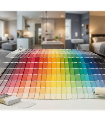
Tips for Choosing the Perfect Green Paint Color
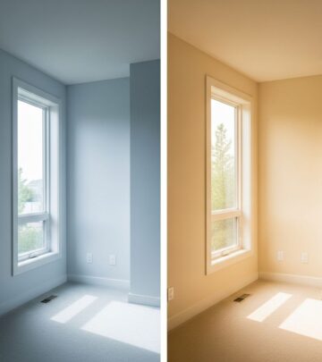
Selecting the right green for your space requires careful consideration of several factors. First, assess your room’s natural light—north-facing rooms benefit from warmer greens with yellow undertones, while south-facing spaces can handle cooler, blue-toned greens. Consider the mood you want to create: peaceful and serene calls for soft sages and gray-greens, while dramatic and sophisticated suits deeper hunter and forest greens.
Always test paint samples in your actual space before committing. Paint large swatches on different walls to see how the color looks in various lighting conditions throughout the day. Observe how it interacts with your existing furnishings, flooring, and fixed elements. What looks perfect in the store or online may appear quite different in your specific environment.
Think about the other colors in adjacent rooms and how your green will flow with the rest of your home. Green’s versatility makes it relatively easy to coordinate, but you’ll want to ensure undertones are compatible. A warm olive green may clash if it meets a cool blue-gray in the hallway, while gray-greens transition smoothly between most color schemes.
Pairing Green Paint with Other Design Elements
Green paint colors serve as excellent backdrops for a variety of design styles and material palettes. Natural materials like wood, stone, and rattan complement green beautifully, reinforcing its connection to nature. Brass and gold metallics create elegant, traditional pairings, while matte black fixtures offer contemporary contrast. White trim and millwork provide classic definition that allows green walls to shine without competing elements.
When selecting textiles and accessories for green rooms, consider patterns that incorporate multiple colors including your wall shade. This creates cohesion and helps tie the room together. Floral patterns, particularly vintage-inspired botanical prints, feel at home against green walls. Stripes, checks, and geometric patterns in complementary colors add energy and visual interest.
Artwork selection becomes easier with green walls, as the color provides a sophisticated backdrop that doesn’t compete. Landscapes feel particularly appropriate, as do botanical prints and nature photography. Abstract art with warm tones creates beautiful contrast against cooler greens, while gold-framed pieces add traditional elegance. Remember that green’s neutrality means it supports rather than overwhelms your decorative choices.
Frequently Asked Questions About Green Paint Colors
Q: What undertones should I look for in green paint colors?
A: Green paint colors can have yellow, blue, gray, or brown undertones. Yellow undertones create warm, cheerful greens perfect for bright spaces. Blue undertones produce cooler, more sophisticated shades ideal for formal rooms. Gray undertones offer subtle, contemporary options that work as near-neutrals. Brown undertones provide earthy, grounded greens perfect for country and farmhouse styles.
Q: Will green paint make my room feel dark?
A: Not necessarily. Lighter greens like sage, mint, and pistachio actually reflect light and can make spaces feel larger. Deeper greens like hunter or forest green will create a more intimate, cocooning effect. Balance darker greens with white trim, light furnishings, and adequate lighting to prevent spaces from feeling too heavy.
Q: What rooms work best with green paint?
A: Green works beautifully in virtually any room. Bedrooms benefit from soothing sage and soft olive greens that promote relaxation. Kitchens look fresh with mint or gray-green cabinets. Living rooms gain sophistication from deep hunter or racing greens. Bathrooms feel spa-like with blue-green or verdigris shades. Home offices become productive spaces with grounding olive tones.
Q: How do I coordinate green paint with existing furniture?
A: Green’s versatility makes it surprisingly easy to coordinate. Warm greens pair beautifully with wood furniture in any tone. Cool blue-greens complement gray, white, and black furnishings. If you have upholstered pieces, pull a green shade that echoes undertones in your fabric patterns. Natural materials like rattan, jute, and linen work universally well with all green shades.
Q: Are green paint colors still trendy in 2025?
A: Green has transcended trend status to become a classic choice. While specific shades may gain popularity, green’s fundamental appeal remains constant. For timeless application, choose greens with depth and complexity—warm olives, sophisticated gray-greens, and rich hunter tones—rather than very light, gray-tinged sages that may feel dated.
Q: Should I paint my ceiling green too?
A: Painting ceilings the same color as walls creates an enveloping, cocoon-like effect that works beautifully with certain greens, particularly gray-greens and deeper tones. This approach makes rooms feel more intimate and considered. For lighter greens or smaller spaces, white ceilings maintain airiness while allowing walls to provide color impact.
Q: What’s the best finish for green paint?
A: For walls, eggshell or satin finishes work best, providing slight sheen that’s easy to clean without being too reflective. Flat or matte finishes suit ceilings and low-traffic areas, while semi-gloss works well for trim, cabinets, and high-moisture areas like bathrooms. Higher sheens intensify color, so test accordingly.
Making Your Green Paint Color Choice
Embracing green paint in your home represents a design decision that honors both tradition and contemporary style. These nature-inspired hues bring the calming, restorative qualities of the outdoors inside, creating spaces that feel connected to the natural world regardless of your location. From the softest whisper of sage to the boldest statement of hunter green, there’s a perfect shade waiting to transform your space.
The key to success with green paint lies in understanding your space’s unique characteristics—its light, its purpose, and its relationship to adjacent rooms—and selecting a shade that enhances rather than fights these qualities. Whether you choose a historic grass green that honors your home’s heritage, a sophisticated gray-green that serves as a contemporary neutral, or a bold racing green that makes an unequivocal design statement, you’re investing in a color with proven staying power.
Green paint colors offer the rare combination of versatility and distinction. They provide enough personality to make spaces memorable while maintaining sufficient neutrality to work with changing décor over time. As you embark on your green paint journey, remember that the best choice is always the one that makes you feel most at home, creating spaces where you’re genuinely happy to spend time. Trust your instincts, test thoroughly, and prepare to fall in love with the transformative power of green.
References
- https://www.countryliving.com/home-design/color/a29958110/best-green-paint-colors/
- https://www.countryliving.com/home-design/color/a65369719/green-paint-trend-2025/
- https://www.kylieminteriors.ca/a-more-colourful-farmhouse-country-paint-palette-real-homes-real-people/
- https://forums.welltrainedmind.com/topic/417202-need-a-good-green-paint-colour/
- https://www.houzz.com/discussions/4855967/best-southern-living-botanical-green-paint-color
Similar Articles
Read full bio of medha deb