The Best Exterior House Color Schemes for Maximum Curb Appeal
Harmonize trims, accents, and siding for a home exterior that captivates at first glance.

Your home’s exterior is its calling card, creating the first impression for visitors and potential buyers alike. The right color scheme doesn’t just express your personal style; it highlights architectural features and blends your home with its surroundings for irresistible curb appeal. This comprehensive guide explores the top exterior house color schemes and offers expert tips to inspire your next home transformation.
Why Exterior House Colors Matter
Choosing the perfect exterior color combination does more than enhance looks—it affects your home’s perceived value, energy efficiency, and the impression you make on your neighborhood. Thoughtful color selection can:
- Highlight architectural details like trim, shutters, and doors.
- Balance size and proportions, making large homes feel inviting and small homes more prominent.
- Blend with or stand out from the surroundings depending on your goals.
Understanding Exterior Color Schemes: The 60-30-10 Rule
Professional designers often follow the classic 60-30-10 rule in creating harmonious palettes:
- 60% – Main color (siding or stucco)
- 30% – Secondary color (roof, garage doors, large trim areas)
- 10% – Accent color (front doors, shutters, smaller trim)
This approach ensures balance and visual interest without overwhelming the eye. Neutrals such as white, gray, and taupe frequently serve as bases, with deeper hues and brighter shades providing contrast in trim or accent elements.
Top Exterior House Color Schemes
Exterior color schemes can be grouped according to classic looks, contemporary twists, or bold statements. Below are tried-and-true options along with tips for customizing each palette.
1. Classic White with Black Accents
- Main: Crisp white siding
- Accent: Black shutters, doors, or trim
- Optional: Subtle gray or charcoal roof
This timeless combination is both fresh and stately. Go for matte black elements for modern flair, or add brass fixtures for a traditional touch.
2. Coastal-Inspired Blues and Whites
- Main: Airy powder blue or weathered navy
- Trim: Bright white
- Accent: Sandy beige or sea-glass green doors and shutters
Perfect for homes in seaside climates or those seeking a breezy, relaxed aesthetic, this palette pairs especially well with stonework or shingled exteriors.
3. Earthy Neutrals with Warm Accents
- Main: Greige (gray-beige), taupe, or soft brown siding
- Trim: Cream or off-white
- Accent: Clay red, terracotta, or deep forest green
Draw inspiration from nature for a warm, inviting feel—ideal for Craftsman, ranch, or bungalows.
4. Moody Grays with Natural Wood
- Main: Charcoal or stormy gray siding
- Trim: Black, slate, or crisp white
- Accent: Natural wood stains for doors and features
The interplay between cool grays and organic materials creates a modern, sophisticated look. Natural wood accents can soften bold palettes.
5. Sage Green with Cream and Burnt Orange
- Main: Sage green or olive siding
- Trim: Cream or light tan
- Accent: Burnt orange or rust for doors/shutters
This palette brings warmth and subtle color to classic and contemporary homes, working particularly well in lush or wooded settings.
6. Dramatic Black, White, and Wood
- Main: Deep black or rich charcoal siding
- Trim: Pure white
- Accent: Natural wood doors and details
High contrast and bold, this scheme feels both modern and welcoming when softened with wood highlights. Use sparingly to avoid overpowering smaller homes.
7. Warm Beige with Olive and Cranberry Accents
- Main: Warm beige siding
- Trim: Creamy white or light olive
- Accent: Deep cranberry or muted green on doors and shutters
These colors create a sense of comfort and traditional allure, especially well-suited for colonial and farmhouse architecture.
Expert Tips for Choosing the Right Exterior Palette
- Consider the setting: Blend with the landscape, neighboring homes, and local architectural style.
- Respect fixed elements: Coordinate with roof color, stone, brick, and hardscape that won’t be changing.
- Balance contrast: Too little may look bland; too much can appear chaotic. Use accent colors prudently.
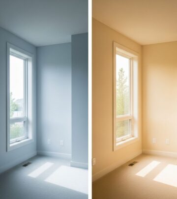
- Review samples in different light: Colors shift dramatically in full sun, shade, and under overcast skies.
How Fixed Elements Influence Color Choices
Permanent features like the roof, brick, stonework, and landscaping act as a starting point for any exterior color selection. Evaluate the underlying undertones in these elements—cool blues or grays vs. warm reds or creams—and choose paint colors that complement rather than clash.
- Warm roof tile? Pair with earth tones and soft creams.
- Granite-gray stone? Try cool whites and deep blue or green accents for harmony.
- Classic red brick? Greige, taupe, or navy work beautifully against its natural warmth.
Popular Accent Colors & Where to Use Them
| Accent Color | Best Use Locations |
|---|---|
| Red | Front door, shutters, planters |
| Cobalt Blue | Shutters, porches, trim against white or gray |
| Hunter Green | Sidelights, garage doors, window boxes |
| Mustard Yellow | Door, trim on neutrals |
| Matte Black | Windows, doors, garage trim |
| Natural Wood Stain | Front doors, porch columns, pergolas |
Inspirational Exterior Color Schemes by Home Style
Cape Cod
- Slate blue or stormy gray siding
- Crisp white or light blue trim
- Red or navy accents
Cottage or Craftsman
- Sage green or putty siding
- Creamy white or deep brown trim
- Amber or burgundy accents
Colonial
- Warm white or soft gray base
- Navy or black shutters
- Striking red or vibrant blue front door
Modern Farmhouse
- Crisp white siding
- High-contrast black or charcoal trim
- Wood grain doors
Mediterranean or Spanish
- Ivory, tan, or clay-toned stucco
- Deep red or terracotta roof tile
- Olive green or cobalt blue doors and details
Using Color Theory in Exterior Paint Selection
Leveraging basic color theory helps you combine hues harmoniously:
- Analogous schemes: Next to each other on the color wheel; offer a serene look (e.g., blue, blue-green, green).
- Complementary schemes: Opposite sides of the color wheel; provide dramatic contrast (e.g., blue and orange, red and green).
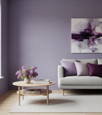
- Monochromatic: Uses tints and shades of the same color for sophistication and simplicity.
Frequently Asked Questions (FAQs)
How many colors should I use on my exterior?
Most pros recommend no more than three: a main field color, secondary color for siding or trim, and an accent.
Should accents match doors and shutters?
Generally, matching these elements creates cohesion, unless the front door is meant as a bold statement—then match shutters to the trim for balance.
Can vinyl siding be painted if I change my mind?
Yes, newer vinyl-safe paints allow you to repaint vinyl siding in a wide variety of hues, but always check manufacturer guidelines for best results.
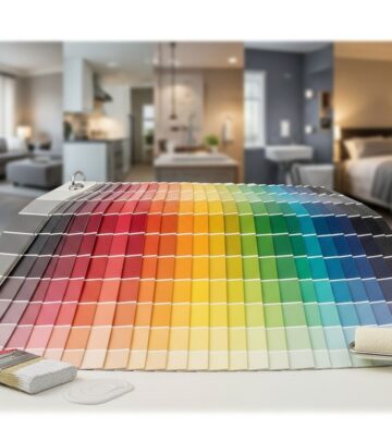
How do I test exterior paint colors?
- Use large painted boards to view colors in different lighting conditions.
- Try digital visualization tools using photos of your house to experiment risk-free.
What is the impact of color on curb appeal and home value?
Smart use of complementary and trendy shades can improve first impressions and perceived value, while out-of-date hues may reduce interest. Consult local real estate trends for the most attractive options in your area.
Extra Color Scheme Tips from the Pros
- Use landscaping to enhance your color palette—plant flowerbeds that echo your accent colors.
- If you belong to an HOA, check regulations before painting to avoid costly mistakes.
- When in doubt, look to historic or regionally traditional color combinations for timeless appeal.
- Never copy the next-door neighbor’s scheme exactly—stand out, but harmonize with the street.
How to Find Your Exterior Color Inspiration
- Walk or drive around neighborhoods to photograph schemes you admire.
- Browse paint manufacturer websites and test digital visualizer tools.
- Use online platforms like Houzz or Pinterest to gather images and mood boards.
Sample Combination Table: Top 5 Palettes
| Primary | Secondary | Accent | Best For |
|---|---|---|---|
| White | Black | Natural Wood | Modern Farmhouse, Colonial |
| Navy Blue | White | Red Door | Cape Cod, Coastal |
| Greige | Off-White | Forest Green | Craftsman, Traditional |
| Charcoal | Slate Gray | Walnut Wood | Contemporary |
| Sage Green | Beige | Amber | Cottage, Ranch |
Conclusion: Make a Lasting First Impression
Choosing the right exterior color scheme requires blending personal taste, architectural style, and neighborhood character. By leveraging classic color theory, considering your home’s fixed elements, and finding inspiration in your surroundings, you can create an exterior that not only dazzles at first glance but also stands the test of time.
FAQs About Exterior House Color Schemes
Q: How can I make my home look larger with color?
A: Lighter shades—such as soft whites, pale grays, or creams—reflect more light and visually expand your home’s footprint from the street.
Q: What colors are best for resale value?
A: Timeless neutrals (gray, white, beige) paired with attractive accents (navy, deep green, or classic red) tend to appeal broadly to homebuyers.
Q: Can I use more than three colors?
A: While the 60-30-10 rule is a guideline, larger or more ornate homes can support multiple accent shades. Ensure all colors remain harmonious and avoid clashing undertones.
Q: How do I coordinate landscaping with my exterior color scheme?
A: Favor greenery or blooms that echo or complement your accent hues. For example, red accents pair beautifully with white hydrangeas or silvery ornamental grasses.
References
Similar Articles

Read full bio of Sneha Tete