14 Inspirational Ways to Add Color to Your Country Home
Discover designer-endorsed tips for infusing every room with cozy, joyful color without sacrificing timeless country charm.

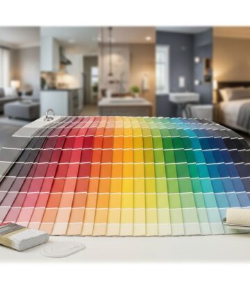
For over a decade, country homes were dominated by white shiplap walls and soft neutral textures. But today, designers agree: infusing vibrant and earthy colors is the key to bringing warmth, personality, and charm into rural living spaces. Whether you are ready to revamp your living room, kitchen, bedroom, or bath, these expert-backed tips will inspire you to embrace and elevate your home with color—everywhere from the walls to the floors, with a perfect balance of whimsy and tradition.
1. Look to the Landscape for Color Cues
One of the most effortless ways to build a cohesive color palette for your home is to draw inspiration from its natural surroundings. Is your house nestled in woodland, perched beside a lake, or set atop rolling fields? Let those environs steer your choices:
- Incorporate greens, blues, or earthy browns that echo the trees, sky, or ground outside.
- Use a “cocoon” effect by enveloping an entire room—walls, trim, and even ceiling—in a single shade inspired by nature, such as a lush forest green or calming sky blue.
- Reinforce the look with natural textures: brown velvet furniture, woven shades, and jute or wool rugs add both comfort and connectivity to the outdoors.
An example of this is an Arkansas family room designed with rich green paint reminiscent of the surrounding woods, elevated by natural fiber furnishings. The result: an immersive, cozy retreat that feels rooted in place.
2. Get Muddy: Embrace Earthy, Muted Tones
Country houses, especially older ones, have long leaned on so-called “muddy” or muted colors derived from natural pigments. These have a timeless, organic feel perfect for rural living:
- Olive greens, deep chocolates, and plummy aubergines mimic the countryside, inviting the outdoors inside.
- Consider paints with clay or sand undertones for extra warmth and authenticity.
- Layer with rustic woods and iron accents to enhance the Old World atmosphere.
These shades work especially well in high-traffic spaces like kitchens and mudrooms, where durability and gracefully aged finishes are particularly appealing.
3. Ground Your Space with Warm Wood
To keep rooms balanced, every country space benefits from the presence of dark or medium wood tones. Wood furniture and decor act as “visual punctuation marks,” giving your eyes a place to rest amidst livelier colors and patterns:
- Anchor the room with a substantial brown wood piece: coffee tables, sideboards, or beds add contrast and solidity.
- Pair bold rugs or painted walls with understated wood tones for sophistication.
- Mix wood finishes (walnut, oak, or mahogany) for a well-worn, collected aesthetic.
Wooden pieces—be they antiques or modern classics—offer clarity, structure, and a sense of history to country décor.
4. Add Whimsy with Wallcoverings
Wallpaper’s resurgence in country homes is no accident; it is an express ticket to instant character and color. If you’re unsure where to start, consider these four P’s for pattern and palette:
- Pastorals: Scenes of rural life or landscapes foster a timeless, bucolic atmosphere.
- Petals: Florals (from delicate prints to bold botanicals) infuse feminine charm. Soften their sweetness with a restrained, monochrome colorway or leafy greens for a more mature take.
- Plaids: Think tartans, checks, and classic patterns. These menswear-inspired prints recall English country clubs and add tailored sophistication to any space.
- Patchwork: Quilt-inspired geometries, whether intricate or minimalist, bring heritage style with endless creative flexibility.
The more conventional the motif, the more you can experiment with daring colors—pastel checks or navy florals, for example—without overwhelming the room’s country roots.
5. Try the “Unexpected Red” Theory
This trend, popularized on social media, proposes that every room can benefit from a splash of red. The surprise element adds confidence and energy, especially in traditionally styled homes:
- Think a bright red lampshade, bold picture frame, or quirky sculpture—something that does not match the rest of the palette.
- This contrast draws the eye and injects playfulness without overpowering the room.
- Use it in moderation for maximum effect—one or two pops are often enough.
Breaking the “rules” of matching intentionality gives your decor personality and a certain effortless chic.
6. Don’t Forget the Floors
Colorful, painted floors are both practical and delightful, providing a hardworking surface and a canvas for creative expression:
- Checkerboard patterns in two contrasting shades (like green and white) brighten mudrooms, kitchens, or sunrooms and evoke European cottages.
- Solid colors, like pale blue or ochre, work beautifully in bedrooms and bathrooms for a soft, enveloping feel.
- Choose paints designed for floors, such as Benjamin Moore’s Floor & Patio or add a clear topcoat for durability.
These painted touches add immediate impact—without changing your walls or major furnishings.
7. Go Vibrant with Vintage Finds
Nothing brings soul and color to a country space like vintage collectibles, especially those that come in a rainbow of finishes. Unleash your inner treasure hunter:
- Seek out mid-century Fiesta ware, colored glass, retro Pyrex, enamelware, and Cornishware—these items layer beautifully in kitchens, dining rooms, and display cabinets.
- Let collected objects, not just paint or textiles, guide your palette and add history to the space.
- Update open shelving or hutches with curated arrangements of these cheerful, storied pieces.
Over time, mixing and matching vintage finds creates a home that feels spirited and collected, not staged.
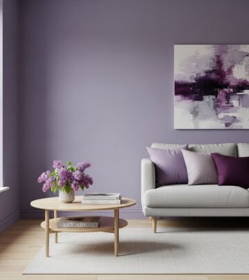
8. Layer Neutrals with Subtle Hues
Not every color statement needs to be bold. Subdued, layered neutral palettes can provide serenity while feeling fresh and on-trend:
- Layer creamy whites, sandy taupes, stone grays, and pale blushes for a soft background.
- Add hints of color—sage, powder blue, or buttery yellow—in textiles or art for quiet vibrancy.
- Natural linens, wool throws, and ceramics offer rich, tactile interest within a neutral framework.
Neutrals serve as a perfect foil for occasional pops of color and let statement pieces take center stage.
9. Mix and Match Patterns with Caution
One hallmark of country style is a fearless approach to patterns—florals, stripes, and checks. But mixing them thoughtfully is essential:
- Start with a large-scale pattern (like an oversized floral wallpaper or rug) as your anchor.
- Add in one or two smaller-scale motifs—think ticking stripes or gingham pillows—for an eclectic but harmonious effect.
- Maintain cohesion with a shared color or tone across all patterns.
This approach turns even playful or contrasting prints into a cohesive whole, rather than a chaotic jumble.
10. Let Art Take Center Stage
Artwork offers a flexible entry point for color. Large canvases, mini gallery walls, or even striking mural panels can influence a room’s entire palette:
- Pick out one or two key colors from a work of art to echo in furniture or accessories.
- Swap artwork seasonally for an easy refresh—watercolors for spring, oils for autumn, for example.
- Don’t shy away from folk art, vintage landscapes, or modern abstract pieces for dynamic contrast.
Art empowers you to make daring color choices you may not try in fixed elements like upholstery or cabinetry.
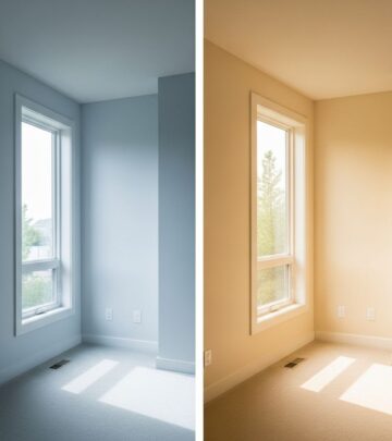
11. Harness the Power of Natural Light
The amount and direction of natural light a room receives should inform your color choices:
- North-facing rooms benefit from warmer, sun-inspired hues (gold, coral, terracotta) to balance coolness.
- South-facing spaces can handle deeper, moodier shades, as sunlight will keep them from feeling heavy.
- Use reflective surfaces (mirrors, high-gloss paint) to maximize brightness in darker rooms.
Tuning your color palette to natural light creates comfort, harmony, and brilliance all day long.
12. Use Upholstery and Textiles as Color Statements
If you’re not ready to commit to painted walls or surfaces, use textiles to introduce color in a flexible, low-risk way:
- Reupholster a chair in mustard velvet or teal linen for major impact.
- Swap in patterned throw pillows, chunky wool throws, or vibrant drapes with every season.
- Layer rugs in different hues and textures—think a jute base with a kilim on top.
Fabrics can be easily refreshed or combined as tastes (or trends) evolve, letting your home’s palette grow with you.
13. Add Splashy Color to Small Spaces
Bathrooms, pantries, and entryways are perfect spots to be daring. Since these areas are typically small, a bold color choice won’t overwhelm, but will make a strong impression:
- Try high-gloss navy walls in a powder room, or grass green on mudroom cabinetry.
- Wallpaper the back of a pantry or closet for a dash of secret joy.
- Paint the inside of cabinets or drawers a bright, unexpected hue.
Small-scale statements turn overlooked zones into favorite features.
14. Personalize with Handcrafted Details
Hand-painted furniture, DIY murals, stenciled floors, or embroidered linens are the finishing touches that can make a house feel truly yours:
- Paint a floral motif on the stairs’ risers; stencil a rug pattern on the floorboards.
- Customize lampshades or cushion covers with fabric paint or applique.
- Use handcrafted ceramics, woven baskets, or homemade wall hangings for both color and texture.
These details connect color to memory, story, and skill, making your interiors as unique as the people who call them home.
Frequently Asked Questions (FAQs)
Q: How do I choose the right color palette for my country home?
A: Start with hues inspired by your home’s exterior landscape and work those colors indoors. Mix in muddy or earthy tones for timelessness, and experiment with colorful accents in textiles, art, or collectibles for layered interest.
Q: What are the best types of wallpaper for a country aesthetic?
A: Look for pastoral scenes, floral motifs, plaids, and patchwork-inspired patterns. Select a colorway that complements your existing furniture and the mood you want to achieve—bold if you love vibrant energy, or softer tones for quiet elegance.
Q: Is it okay to use dark or vibrant colors in small rooms?
A: Absolutely—small spaces are ideal for bold experiments! Try deep greens or blues, or a pop of unexpected red, to turn these rooms into memorable, jewel-box spaces. Balance with plenty of light and keep the overall scheme simple.
Q: How can I add color without painting walls or making permanent changes?
A: Use textiles (rugs, drapes, pillows), colorful vintage dishes, painted furniture, and wall art. These pieces are easy to swap or update and can completely change the mood of a space without major renovation.
Q: What is the easiest way to experiment with color for beginners?
A: Start small by introducing a few colorful accessories—a patterned pillow or bright vase. Gradually build confidence by mixing in bolder pieces, working your way up to painted floors or wallpaper if you feel adventurous.
References
- https://www.countryliving.com/home-design/color/a61520930/decorate-with-color/
- https://withwonderandwhimsy.com/2025/06/12/english-country-living-room-ideas/
- https://www.countryliving.com/home-design/decorating-ideas/a68016461/decorate-for-fall-without-orange/
- https://town-n-country-living.com/decorating-with-bold-colors.html
- https://www.houzz.com/discussions/3052688/help-how-to-bring-bold-colour-and-design-but-still-keep-cozy-country
Similar Articles

Read full bio of medha deb