Mindful Use of Color and Texture in Creativity: A Complete Guide
Mastering hue and surface lets creatives evoke emotion and focus through visual depth.
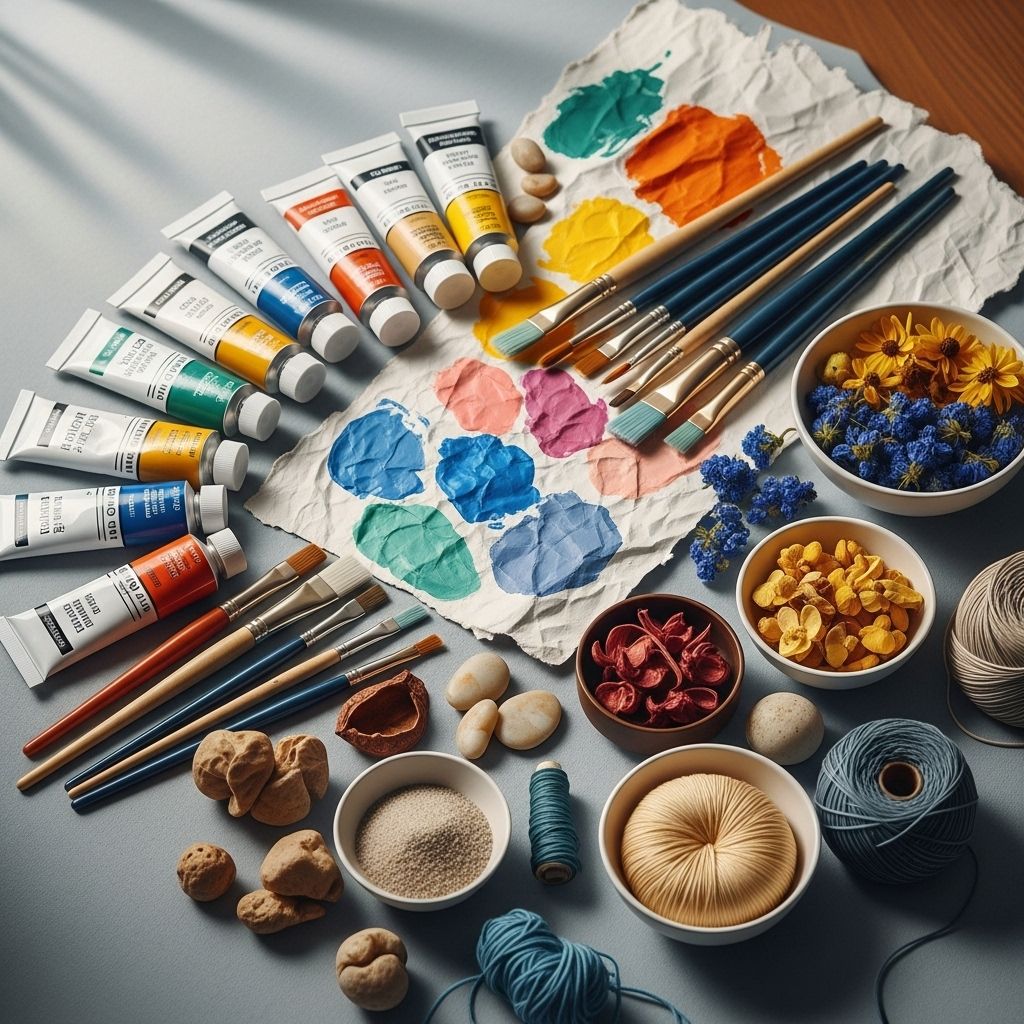
The intersection of color and texture in creative work extends far beyond mere aesthetic choices. These fundamental design elements serve as powerful tools for emotional communication, cognitive enhancement, and artistic expression. Understanding how to use color and texture mindfully can transform not only the quality of creative output but also the creative process itself.
Table of Contents
- Understanding Color Psychology in Creative Work
- The Science Behind Color and Creativity
- Texture Fundamentals in Creative Expression
- Mindful Color Selection Strategies
- Texture Application Techniques
- Combining Color and Texture Effectively
- Practical Applications Across Creative Fields
- Cultural and Contextual Considerations
- Tools and Techniques for Implementation
- Frequently Asked Questions
Understanding Color Psychology in Creative Work
Color psychology forms the foundation of mindful creative practice. The relationship between color and human emotion operates on both conscious and subconscious levels, influencing mood, behavior, and cognitive performance. Research in neuroscience reveals that color perception activates specific neural pathways associated with memory, emotion, and decision-making processes.
The emotional impact of color stems from evolutionary associations, cultural conditioning, and personal experiences. Warm colors like red, orange, and yellow typically evoke energy, passion, and excitement, while cool colors such as blue, green, and purple tend to promote calmness, focus, and introspection. However, the intensity, saturation, and context of these colors significantly modify their psychological effects.
In creative contexts, color serves multiple functions beyond emotional expression. It establishes visual hierarchy, guides attention, creates atmosphere, and communicates meaning. The mindful application of color requires understanding these various roles and selecting colors that align with creative intentions rather than defaulting to personal preferences or trending palettes.
The Science Behind Color and Creativity
Scientific research has revealed fascinating connections between color exposure and creative performance. Studies demonstrate that blue environments significantly enhance creative thinking and idea generation compared to red environments. This phenomenon occurs because blue is associated with openness, peace, and tranquility, mental states conducive to creative exploration and risk-taking.
The mechanism behind color’s influence on creativity involves both physiological and psychological processes. Blue light stimulates the production of cortisol and promotes alertness while reducing anxiety, creating optimal conditions for divergent thinking. Conversely, red tends to increase arousal and stress levels, which can inhibit the open-minded thinking necessary for creative breakthrough.
Natural colors derived from organic environments consistently promote positive emotional states and enhanced creativity. Forest greens, sky blues, earth browns, and sunset oranges tap into our innate biophilia, the human tendency to seek connections with nature. This connection explains why natural color palettes often feel more harmonious and inspiring than artificial or highly saturated color schemes.
| Color | Psychological Effect | Creative Application | Best Used For |
|---|---|---|---|
| Blue | Enhances creativity, promotes calm focus | Brainstorming, ideation | Innovation projects, artistic exploration |
| Green | Reduces eye strain, promotes balance | Sustained creative work | Long-term projects, detailed work |
| Yellow | Stimulates mental activity, optimism | Energy and enthusiasm | Collaborative work, presentations |
| Red | Increases urgency, attention to detail | Precision tasks, deadlines | Editing, refinement, urgency |
Texture Fundamentals in Creative Expression
Texture adds dimensional depth to creative work, engaging multiple senses and creating rich, layered experiences. Unlike color, which primarily affects visual perception, texture can be both seen and felt, making it a uniquely powerful tool for emotional and sensory engagement.
Visual texture refers to the perceived surface quality of materials or digital elements, while tactile texture involves actual physical surface variations. Both types contribute significantly to the overall impact of creative work. Smooth textures suggest refinement, cleanliness, and modernity, while rough textures convey authenticity, strength, and earthiness.
The psychological impact of texture operates through associative memory and sensory processing. Our brains automatically connect textural experiences with emotions and memories, making texture a potent tool for storytelling and emotional communication. Soft textures evoke comfort and safety, while sharp or angular textures suggest energy and dynamism.
In digital media, texture simulation has become increasingly sophisticated, allowing creators to incorporate tactile experiences into virtual environments. Understanding how different textures affect perception enables more intentional and effective creative decisions across both physical and digital mediums.
Mindful Color Selection Strategies
Mindful color selection begins with clearly defining the emotional and functional goals of the creative work. Rather than choosing colors based on aesthetic preference alone, mindful creators consider the psychological impact, cultural associations, and contextual appropriateness of their color choices.
The process starts with understanding the target audience and their cultural background. Color meanings vary significantly across cultures, and what appears harmonious in one context may be jarring or offensive in another. For instance, while white symbolizes purity in Western cultures, it represents mourning in many Eastern traditions.
Environmental factors also influence optimal color choices. The lighting conditions, surrounding colors, and viewing context all affect how colors are perceived and their psychological impact. Colors that work beautifully in natural daylight may appear completely different under artificial lighting or on digital screens.
Seasonal and temporal considerations add another layer to mindful color selection. Certain colors feel more appropriate during specific times of year or day, and aligning color choices with natural cycles can enhance the resonance and effectiveness of creative work.
Color Harmony Principles
Creating
References
- https://mindiply.com/blog/post/whats-the-colour-of-creativity
- https://platt.edu/blog/psychology-color-graphic-design/
- https://selahcreativeco.com/blog/introduction-to-color-psychology-in-design
- https://sierracreativestudio.com/blogs/journal/color-psychology-for-creative-branding-crafting-emotional-connections-through-color-choices
- https://unikavaev.com/blog/color-psychology/
- https://www.rasmussen.edu/degrees/design/blog/psychology-of-color/
- https://www.adobe.com/creativecloud/design/discover/color-meaning.html
- https://99designs.com/blog/tips/color-psychology/
Read full bio of Sneha Tete

