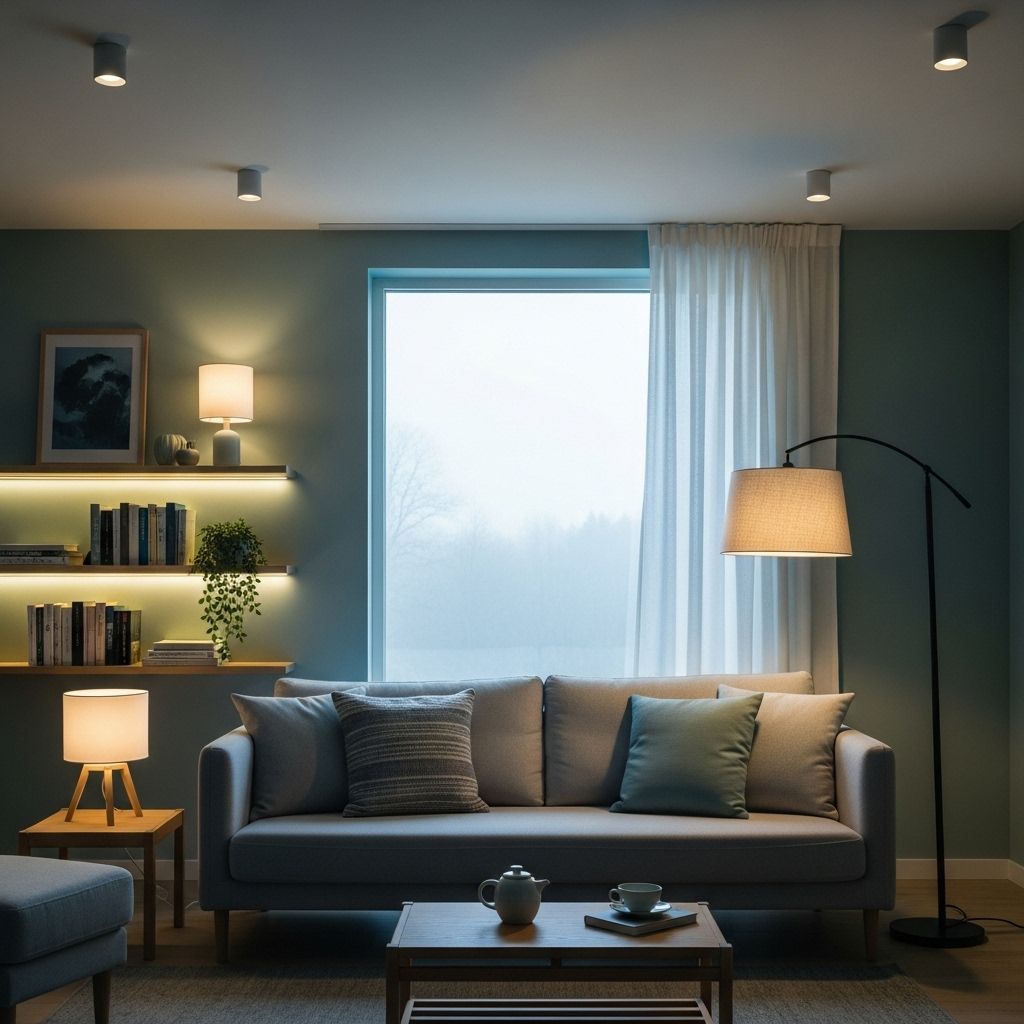
Color Psychology & Lighting: Designing Calming Spaces for Mental Well-Being
Layer natural textures with gentle illumination for a peaceful, stress-free atmosphere.

Modern interior design goes beyond aesthetics—it actively shapes our mental and emotional well-being. Understanding how color psychology and lighting interact gives us powerful tools to transform spaces into sanctuaries of calm, comfort, and restoration. This article explores the science and art of using color and light to create tranquil environments that enhance relaxation, reduce stress, and support holistic health.
Table of Contents
- Introduction: The Link Between Environment and Emotions
- Color Psychology: How Colors Influence Mood
- Choosing Calming Colors: Room-by-Room Guide
- The Role of Lighting in Calming Spaces
- Harmonizing Color and Light for Restful Spaces
- Enhancing Calm with Texture, Material, and Decor
- Common Mistakes in Creating Calming Spaces
- Practical Tips for a Peaceful Environment
- Frequently Asked Questions (FAQs)
- Conclusion: Designing Your Sanctuary
Introduction: The Link Between Environment and Emotions
Where we spend our time profoundly affects our inner world. Research consistently shows that the arrangement, color, and lighting of a space can influence our stress levels, productivity, and even our overall happiness . Particular attention to color choice and lighting conditions forms a critical part of mental wellness through design. From the home to the office, mindful design transforms ordinary rooms into havens of serenity, helping us escape modern life’s overstimulation.
Color Psychology: How Colors Influence Mood
Color psychology studies how various hues impact human emotions and behaviors . Choices in color evoke immediate, sometimes subconscious, responses. The effect isn’t always universal—cultural context and personal preference matter—but some general trends are widely accepted.
Key Colors and Their Emotional Impact
| Color | Emotional Effect | Recommended Use |
|---|---|---|
| Blue | Calming, lowers blood pressure, reduces anxiety | Bedrooms, bathrooms, meditation spaces |
| Green | Refreshing, harmonious, reduces stress | Living rooms, offices, entryways |
| Yellow | Uplifting, energizing, stimulates optimism | Kitchen, dining, creative areas |
| Orange | Stimulating, warms mood, social energy | Activity or fitness rooms |
| Purple (lavender) | Soothing, spiritual, sophisticated | Bedrooms, meditation rooms |
| Neutral (grey, beige, taupe) | Calm, balanced, flexible | Anywhere, best for layering textures |
| White | Clean, peaceful, expansive | All rooms, ideal for base color |
| Red | Activating, energetic, intense | Best as an accent, avoid in large calming spaces |
While reds and bright oranges can raise heart rates and create a sense of urgency or excitement, blues and greens are universally understood to evoke calm and restoration—attributes highly valued in calming spaces .
Cool vs. Warm Colors
- Cool Colors (Blue, Green, Soft Purple): Bring calm, quiet, and restful sensations. Perfect for bedrooms and bathrooms.
- Warm Colors (Yellow, Orange, Red): Add vibrancy and energy, better for gyms, kitchens, or social spaces where stimulation is desired.
Neutral Colors in Calming Design
Neutral tones such as soft greys, whites, taupes, and creams are foundational in creating serene atmospheres. Their lack of saturation makes them restful to the eye. Modern trends favor pairing them with natural textures for extra tranquillity .
Choosing Calming Colors: Room-by-Room Guide
For effective relaxation, selecting calming colors tailored to each space’s function is essential:
- Bedrooms: Use cool blues or sage greens to lower stress and promote rest. Muted lavender or dusty rose works well too for a nurturing vibe.
- Living Rooms: Go for gentle greens, soft greys, or light beige, layered with natural accents (wood, rattan, linen) to maximize hospitality and relaxation.
- Bathrooms: Aqua blue, misty green, pale taupe, or pure white can make small spaces feel like mini spas.
- Home Office: Soft green or blue is linked to focus and reduced stress, while a pale yellow accent can impart optimism.
- Kids’ Rooms: Muted pastels (mint, baby blue, butter yellow) keep excitement at bay without feeling cold.
Nature-Inspired Palettes
Integrating colors found in nature—like ocean blue, mossy green, and earthy sand—grounds energy and brings the outside in, further promoting relaxation and mental clarity .
The Role of Lighting in Calming Spaces
Equally as critical as color, lighting shapes how we perceive and feel within a room. Quality light has both psychological and physiological effects, with natural light offering the most substantial mood benefits .
Types of Lighting for Calming Spaces
- Natural Light: Maximizes serotonin production, improving mood and reducing anxiety. Large windows, sheer drapes, and well-placed mirrors amplify daylight.
- Ambient Lighting: Even, soft general illumination from ceiling fixtures or recessed lights creates an inviting foundation.
- Task Lighting: Focused lights for activities (reading, desk work) should be bright but not harsh, ideally adjustable for personalization.
- Accent Lighting: Floor lamps, table lamps, or LED strips add visual interest and gentleness when layered with other light sources.
Lighting Color Temperature
| Type | Color Temperature (Kelvin) | Mood/Effect |
|---|---|---|
| Warm White | 2700–3000K | Cozy, relaxing, intimate |
| Neutral White | 3500–4100K | Balanced, natural, day-to-day tasks |
| Cool White | 5000K+ | Alertness, focus; avoid for restful spaces |
For calming environments, opt for warm or neutral white light. Avoid overly cool, bluish lights, which may inhibit relaxation and even disrupt sleep cycles.
Light Intensity and Control
- Dimmers: Adjustable brightness allows for responses to changing needs throughout the day.
- Layering: Combine natural, general, and accent lighting to avoid shadows and stark contrasts.
- Glare Reduction: Use frosted bulbs and covers to prevent harsh lighting.
Harmonizing Color and Light for Restful Spaces
Color and light interact to define atmosphere. The same color may look soothing under natural sunlight but stark beneath fluorescent lights. Key principles include:
- Test paint colors in varying light before committing. Observe shades in daytime, evening, and artificial light.
- Use complementary color temperatures: Warm colors (peach, beige) feel richer under warm white lighting, while cool colors (aqua, soft blue) pair best with neutral, natural light.
- Reflective surfaces: Light-colored walls, mirrors, and shiny finishes help distribute light gently, eliminating harsh shadows.
- Accent lighting: Place soft-glow lamps in reading corners or meditation nooks to cultivate peace.
Enhancing Calm with Texture, Material, and Decor
Beyond color and light, the use of texture and natural materials can amplify the sense of comfort and tranquility:
- Textiles: Soft fabrics (linen, cotton, wool, velvet) add warmth and coziness, reducing the perception of starkness with neutral palettes.
- Natural Elements: Wood, stone, woven baskets, and live plants offer grounding, organic vibes that lower stress.
- Declutter: Minimal, well-organized décor keeps the mind from overstimulation and fosters calm.
- Art & Greenery: Peaceful art, botanical prints, or indoor plants reinforce the connection to nature and support relaxation.
Common Mistakes in Creating Calming Spaces
- Using too many bright or clashing colors, which can become overstimulating and counteract calm.
- Overly cool blue/white lighting, often found in some LEDs or fluorescents, which can be harsh and anxiety-producing.
- Neglecting balance between function and beauty: Calming spaces should be both restful and practical.
- Ignoring natural light: Artificial lighting should supplement, not replace, daylight whenever possible.
- Too much minimalism: Sterility can feel unwelcoming; counterbalance with warmth via materials and texture.
Practical Tips for a Peaceful Environment
- Choose two main colors plus one accent to avoid visual overload.
- Maximize natural light where possible; clean windows, use light curtains.
- Invest in warm-dimmable bulbs for evening relaxation, especially in bedrooms and lounge areas.
- Bring in houseplants for both color and improved air quality.
- Layer fabrics: add cozy blankets, pillows, and rugs for tactile comfort.
- Consider your personal associations with certain colors, adjusting palettes to your comfort.
Frequently Asked Questions (FAQs)
Q: Which paint color is scientifically proven most calming?
A: Soft blues and gentle greens are widely recognized as the most calming due to their association with nature and ability to lower anxiety levels .
Q: Can I use dark colors in a calming space?
A: Yes, but sparingly and thoughtfully. Deep forest greens or navy blues can create a cocooning effect if balanced with lighter elements and ample soft lighting.
Q: How does artificial lighting compare to natural light?
A: Natural light is best for well-being, but well-designed artificial lighting (warm, well-distributed, dimmable) can successfully mimic its benefits in areas with limited sunlight .
Q: Do scented candles or aromatherapy contribute to a calming space?
A: While not directly related to color or lighting, scents (like lavender or eucalyptus) can complement a calming environment and enhance relaxation.
Q: What is the most common mistake in designing relaxing rooms?
A: Using overly bright or mismatched colors and choosing harsh, direct lighting that creates glare and discomfort.
Conclusion: Designing Your Sanctuary
By mindfully combining the psychological effects of color with strategically layered lighting, anyone can design spaces that soothe the mind and nourish the spirit. Thoughtful integration of texture, natural elements, and practical layout turns rooms into sanctuaries that foster healing and restoration. Start small—choose a room, select a calming palette, optimize your lighting, and see how your mood transforms.
References
- https://www.emilgroup.com/magazine/how-does-interior-design-help-mental-health-how-to-transform-your-space-and-mind/
- https://tablebases.com/blog/how-colors-and-patterns-affect-relaxation/
- https://paintcalgary.ca/role-of-color-psychology-in-interior-design/
- https://www.stoneside.com/resources/articles/interior-design-understanding-the-psychology-of-color-in-spaces
- https://www.spacerefinery.com/blog/colors-psychology-guide
- https://unikavaev.com/blog/color-psychology/
- https://mindfuldesignconsulting.com/the-psychology-of-color-in-commercial-interior-design/
- https://siba.edu/why-color-theory-is-essential-in-interior-design/
- https://www.ducydesign.com/blog/the-emotional-impact-of-color-psychology-in-interior-design
Read full bio of medha deb


